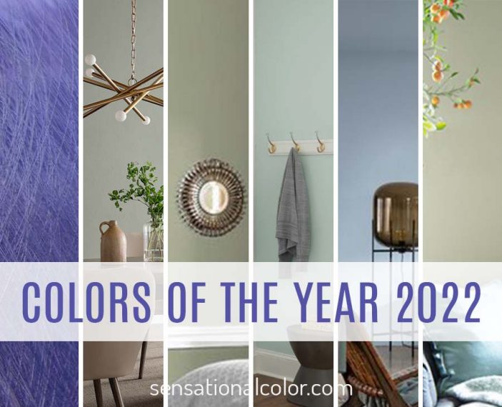
The story of the Color of the Year 2022 is all about a hue often called nature's neutral -- green. Sherwin-Williams, Pittsburg Paints, Benjamin Moore, and Behr all selected shades of this earthy color as an essential color for the upcoming year. Why so popular?
Weary of lifestyle changes they didn't sign up for and never thought would last this long, green symbolizes many things people crave -- rebirth, prosperity, and progress.
Physically, green is connected to nature and has a relaxing, calming effect on our bodies, increasing focus. Designers often use the color green in spaces to foster creativity and productivity. Perfect! One thing that people agree on is their need for a peaceful environment.
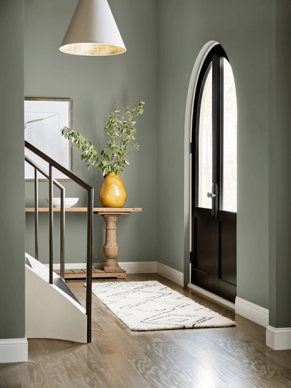
Why Green is the Overall 2022 Color of the Year
The gray trend gave way greige, a warm gray-toned with beige, then beige. In 2022, surrounding ourselves with neutrals doesn't feel as satisfying after spending so much time inside. Previously these neutrals provided respite from visual and mental overload, but when at home almost 24/7, a backdrop of gray and beige doesn't have as much appeal.
Homeowners want to add color, yet not everyone is ready to step into the deep end. Green gently helps even the most color-shy person dip a toe into more colorful options. With unlimited shades, green can be light or dark, warm or cool, bright or muted -- there is a green for every decorating scheme.
Grayed green and beige-y greens are gaining popularity as a replacement for gray or beige. Many call green toned down with gray or beige "green-eige," a play on the term greige (a mix of gray and beige.)
Next are details about each company's choice for Color of the Year 2022, starting with the companies that chose a shade of green as this year's color.
Beyond Green
Pantone and Dulux (Akzo Nobel} went in other directions, choosing violet and light airy blue, respectively. The light blue selected for Dulux was born out of the same desires that inspired green. The violet-blue selected by Pantone is also about a need to escape, but not into nature. They look to the metaverse to take you outside the walls of your home and office in a new way.
Let's first look at the greens and follow with these outliers.
Sherwin-Williams Color of the Year 2022 Evergreen Fog SW 9130
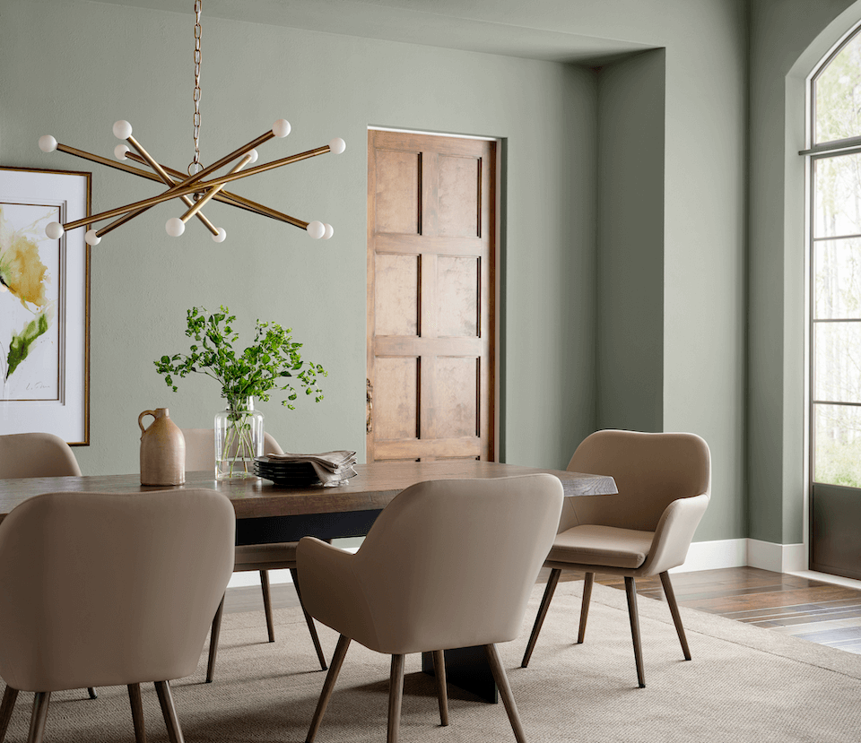
Evergreen Fog SW 9130 is a sophisticated wash of color for spaces that crave a subtle yet stunning statement shade
More people are flocking to organic textiles and natural materials
Sue Wadden, director of color marketing at Sherwin-WilliamS
.
“Evergreen Fog inspires us to begin again and is a great choice for modern interiors and exteriors.”
“The calming green represents so much more than a deeper dive (and perhaps return) into a more muted palette...in the past few years, neutrals have been warming up and we have prioritized sustainability and organic living more than ever. While just five years ago we may have gone for that polished contrasted look in our homes, more people are flocking to organic textiles and natural materials.”
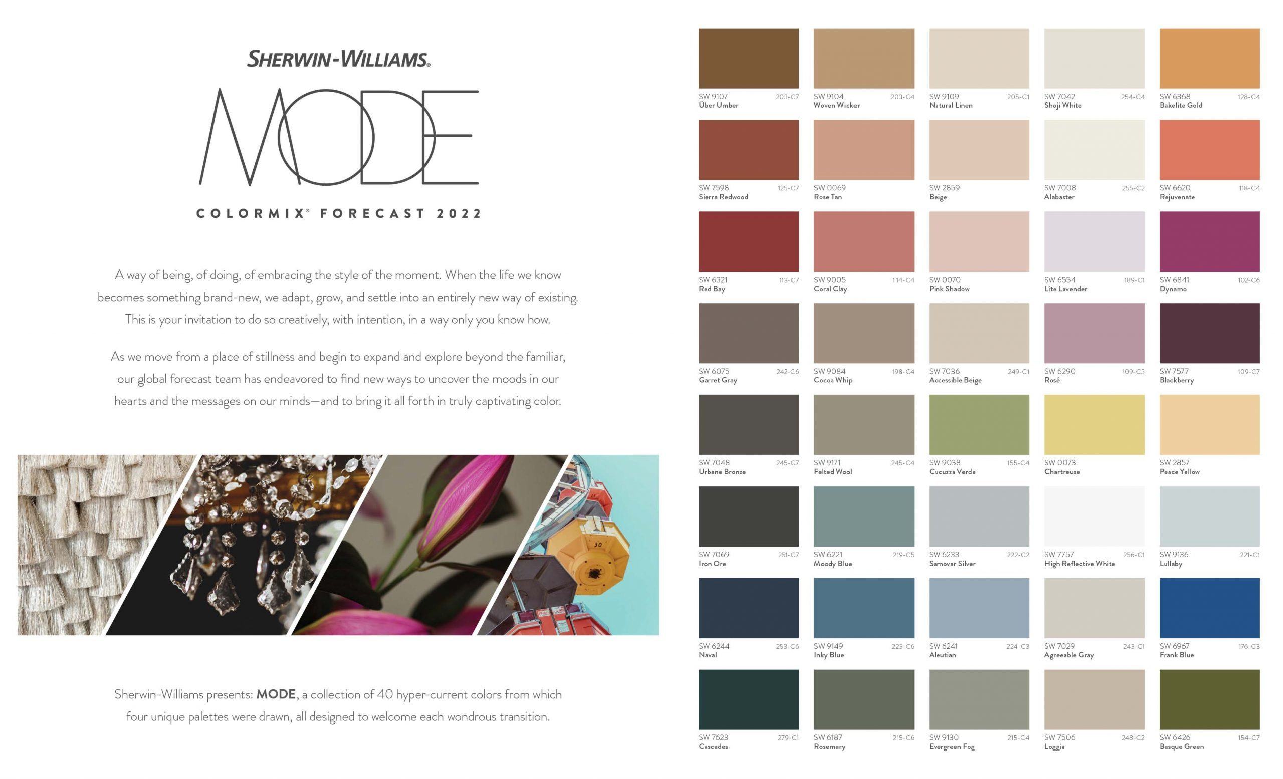
Sherwin-Williams always puts together an excellent trends report. What follows are the four trend categories they selected as important for 2022 and how they describe each.
Sherwin-Williams Color Trends 2022
Method
With patience, you'll perfect your own natural process. A mix of organic neutrals — both warm and soft — make for a space that's both lushly refined and totally effortless.
Opus
Deep within, there there's a little flair for the dramatic in all of us. Explore a deeply mysterious collection of dark jewel tones accented with bright pops of color.
Dreamland
A refreshed space represents a new beginning — awaken the senses with a collection of sweetly spirited greens, pinks, and cool neutrals.
Ephemera
Good style never gets old. The pieces from our past just get better with time, like this nostalgic palette of muted-but-cheerful reds and blues, green and yellow.
- View Sherwin-Williams Color Mix 2022 Color Trends
- More about Sherwin-Williams Color of the Year 2022
Benjamin Moore Color of the Year 2022 October Mist 1495
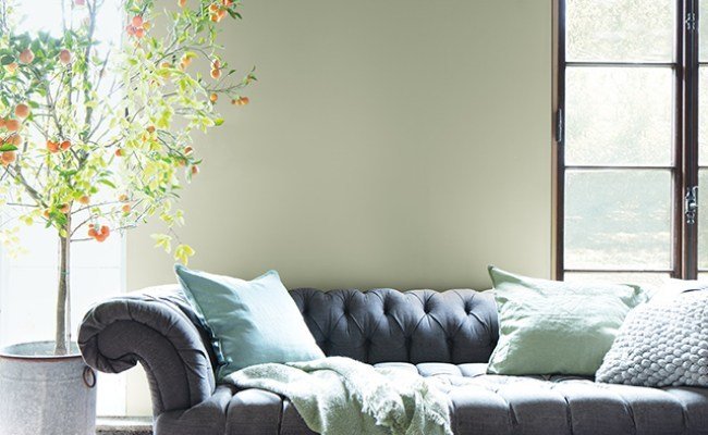
October Mist 1495 is a gently shaded sage that quietly anchors while encouraging creative expression through color.
The Color Trends 2022 palette invigorates the senses and gives root to personal style.
Andrea MagnO
Benjamin Moore Director of Color Marketing & Development
.
“As the spaces in our homes continue to evolve, we uncover more opportunities to express our individuality and leverage the power of color to design environments that serve different functions and styles.”
“October Mist 1495 and the corresponding Color Trends 2022 palette reflects an effortless harmony of colors, while inspiring unique combinations for any paint project.”
Benjamin Moore described this color as evoking the silver-green stem of a flower, that could act as a bridge to a rainbow of hues. October Mist creates a canvas for other colors - and your imagination - to blossom.
I concur. Greens, especially the muted shades like those ono trend this year, provide a background for a wide range of colors.
Benjamin Moore Color Trends 2022
October Mist 1495 is one of the 14 colors Benjamin Moore included in their 2022 Color Trends palette.
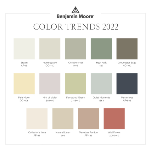
click on the image to enlarge
PPG Color of the Year 2022 Olive Sprig PPG1125-4
“As many of us know following a year of lock down, the easiest way to shift your mindset is to change your environment. While we begin to trade sweatpants for strappy shoes, recipes for reservations, and a night in for a night out, our paint color preferences are shifting too, in both residential and commercial spaces,” said Amy Donato, senior color marketing manager, PPG Paint.
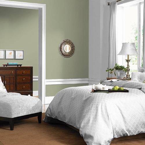
Olive Sprig is a midtone, neutral, lush green with an organic green undertone.
Sophisticated grey-green represents healing, regrowth, resiliency post-pandemic.
AMY DONATO,
PPG PAINT, senior color marketing manager, architectural and industrial coatings.
“Olive Sprig is a relaxed, but enticing green that emulates the feeling of soothing aloe vera or a fragrant plant – brightening any space with organic liveliness. A versatile color that lives well inside or outside, Olive Sprig blends into nearly any environment.”
"Elegant, grounded, versatile and highly-adaptable, this soft gray-green is soothing, like a fragrant plant, reminiscent of the natural world; it brightens any space with an organic liveliness. It is inside or out, the perfect refresh."
“...shifting away from the stark, neutral palettes of yesterday and opting for color in all forms -- call it rebellion, but we are certainly here for the resurgence of optimistic colors to guide us into a new era of home design.
”Lending itself to be paired with natural materials, Olive Sprig looks beautiful alongside unique architectural elements and furniture with curved forms to create a comfortable and grounded space. The color can help create a sanctuary in a bedroom, encourage focus in an office, offer the perfect neutral backdrop in a retail or restaurant, and create a grounded getaway in hotels.
After the rise of working from home and remote learning, homeowners have shifted away from open concept living spaces to individual rooms in order to create privacy and compartmentalize working life from personal. For those in need of a little more separation, painting a wall or nook a different color from the rest of the room is a simple, affordable project that can instantly transform a space and help create boundaries in your home that will change and adapt as our lives do.
Under the theme Horizon, which represents our current state of hope, reflection and new beginnings in the post-pandemic era, PPG’s color experts identified three color stories that will resonate in 2022:
PPG Color Trends 2022

Invaluable
The Invaluable palette culminates a rich library of cultural references to imagine its perfect place in today’s world. Drawing Gatsby-esque inspiration from thepast to create the go-to glamourous palette of the present, this color story is not afraid tobe bold. Grounded with rich hues like PPG’s Gooseberry, Castle Stone and Ancient Copper, the Invaluable palette adds depth and warmth to any space. Pair these colorswith rich, dark woods and brass accents to really turn up the drama – especially in thehome, restaurants or hotels.
Introspective
The Introspective color story is for those that prioritize self-care and appreciate life’s simple pleasures. Create a serene and intimate space with colors like PPG’s Tea Time, Peace, Silver Service and Pine Whisper, which complement the soothing comfort of Olive Sprig. These hues are perfect for the private yet soulful consumer looking to create an ethereal bedroom retreat, a thoughtful office space, or add a hint of color to an otherwise neutral-toned kitchen.
Inspired
Those drawn to the Inspired color palette cannot be pinned down! These mood-boosting shades are sure to turn up the volume in any space and add anoptimistic jolt of energy for spaces that need it most – like a statement-making front door, a unique retail environment, or an inspiring child’s playroom. PPG’s Cenote, Aloha andLettuce Alone offer liveliness and mimic high-tech greens and blues that are sure to turnheads. Warm hues like Paris Pink, Coral Silk and Crushed Pineapple are perfect picksfor the confident, social and adventurous painter who wants to spread joy, embrace change and break free from minimalist designs of years past. PPG’s Olive Sprig acts as a muted neutral in this palette to ground the bolder, brighter color counterparts.
Behr Color of the Year 2022 Breezeway MQ3-21
Looking ahead to 2022, we have a desire to embrace a sense of renewal and to explore new hobbies or adventures, both near and far, that excite us. The BEHR® 2022 Color of the Year, Breezeway MQ3-21, evokes feelings of coolness and peace while representing a desire to move forward and discover newfound passions.
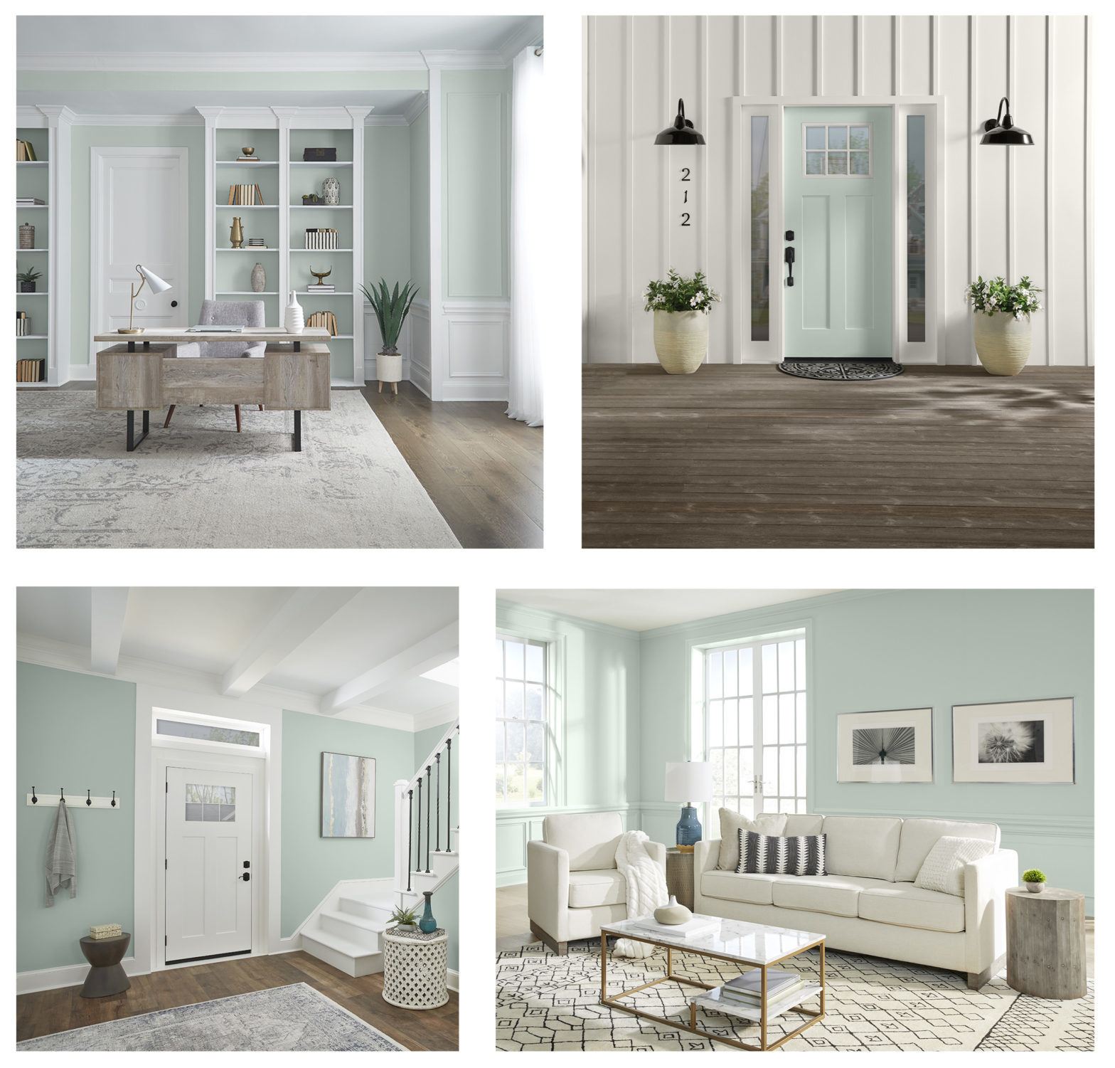
Behr’s 2022 Color of the Year and Color Trends Palette encourages everyone to embrace the path ahead with uplifted spirits.
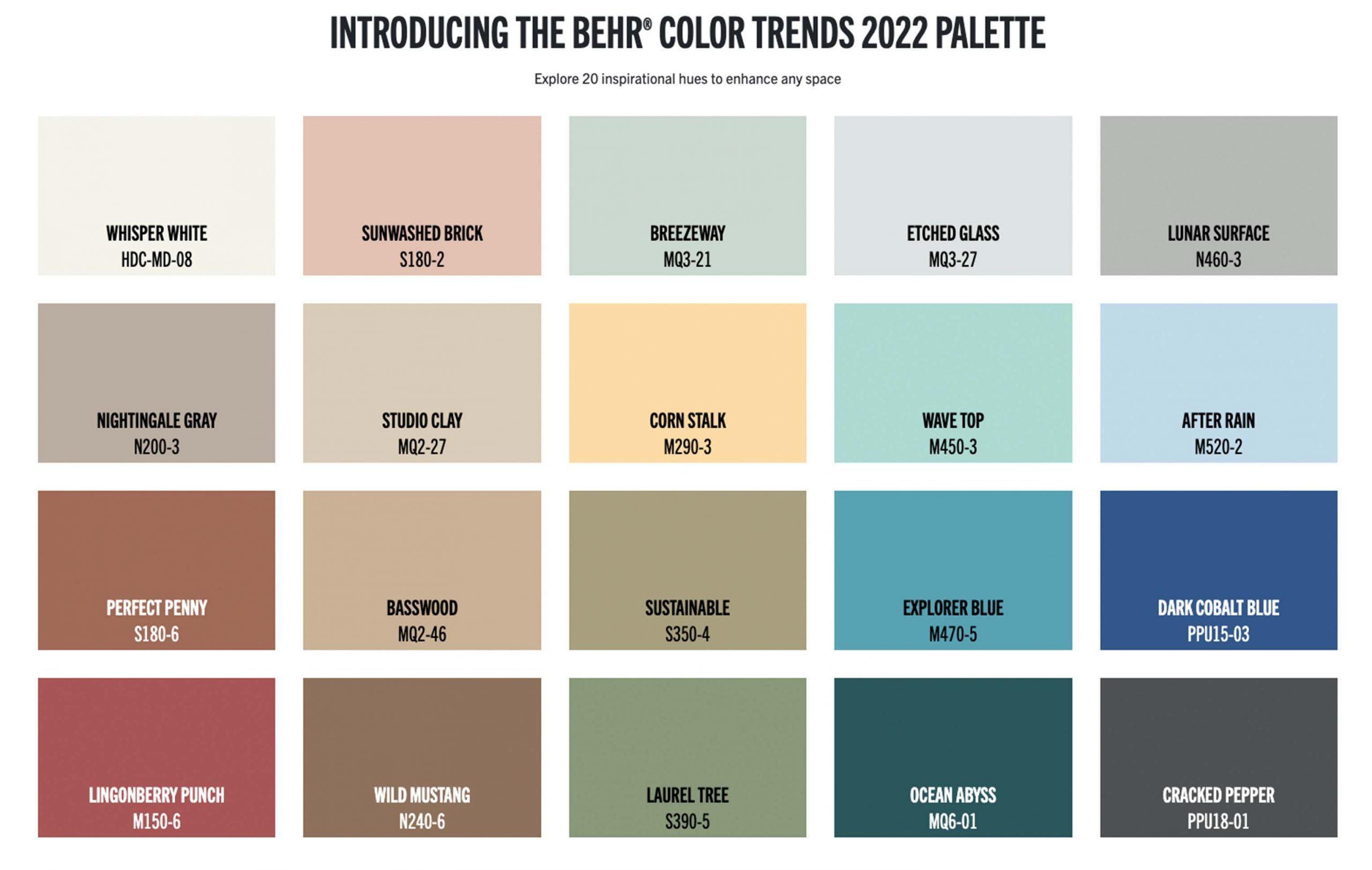
The palette’s 20 colors inspire us to enter the new year on a hopeful note, while still centering the home as an ultimate oasis..
Erika Woelfel
vice president of color at Behr.
.
"A silvery green shade with cool undertones. The color is inspired by naturally stunning sea glass found on the shore of salty beaches."
"Light tones can be balanced with bold, uplifting accents to emphasize a dynamic perspective."
Breezeway, is found within the BEHR® Color Trends 2022 Palette. The 20-color collection consists of soothing shades and warmer tones including the timelessness of Whisper White HDC-MD-08, and the bold terracotta red of Perfect Penny S180-6. Alongside Breezeway, the palette’s 20 colors inspire us to enter the new year on a hopeful note, while still centering the home as an ultimate oasis..
SERENE SANCTUARY
Cool and dramatic tones create a cozy bedroom for a comforting retreat.
NATURAL INFLUENCES
Bring the outdoors inside with warm mid-tones combined with natural materials.
FLEXIBLE SPACES
Mix it up in a white kitchen backdrop with dark and dramatic cabinets and a touch of green for an earthy connection and hint of playfulness.
Dulux Color of the Year 2022 Bright Skies
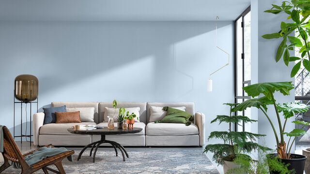
Bright Skies and its supporting palettes will bring a breath of fresh air into homes all over the world – maybe even yours.
People are craving expansion after a spell of feeling shut in.
Heleen van Gent, Creative Director of AkzoNobel’s Global Aesthetic Center.
.
“Recent events have illuminated all aspects of our lives, making us reconsider what really matters. As we shape a new future, it’s time for a fresh approach to everything. Bright Skies reflects the limitless skies around us and brings a hint of the natural world inside, bringing in the “breath of fresh air”, we need to turn our dreams into reality."
"People are craving expansion after a spell of feeling shut in: open air, a connection to the great outdoors, a fresh approach to everything and a new start."
Add morre
Dulux Color Trends 2022

GREENHOUSE upper left
In a rural location, these light, fresh naturals beautifully complement your surroundings. In an urban space, they can make you feel in touch with the natural world.
STUDIO upper right
Together, these soft and airy shades can help you escape the everyday and give a room a comfortable, consoling feel.
WORKSHOP lower left
If your living room is constantly reinventing itself, switching from social hub to home office to kids’ classroom, you need a color scheme that can keep up.
SALON lower right
Your home should be somewhere that you feel safe and comfortable to embrace new ideas. Within the Salon palette are a combination of soft whites and light neutrals that can provide the perfect blank canvas for your daily life.
Pantone Colors of the Year 2022
Pantone had a surprise in store with their choice of 2022 Color of the Year: Very Peri (PANTONE 17-3938). Rather than pick from their extensive catalog, for the first time in the Color of the Year’s 23-year history, the Pantone Color Institute decided to create an entirely new color to “reflec[t] the global innovation and transformation taking place” as we emerge from isolation into a radically changed world. The color unexpected – not unlike our transition into the world’s new post-pandemic normal.
Last year, Pantone’s two-color choice showed how uncertain the world felt going into 2021, but this year, we look towards something brand-new. Very Peri mirrors our collective desire to get back a sense of play, fun, and hope. It’s revitalizing and joyful. Even Pantone's video short introducing the color evokes a sense of spritely whimsy. Bubbles pop into tendrils of furry, fiber optic texture, undulating in an unseen current.
This new color communicates a readiness for the future. According to Leatrice Eiseman, executive director of the PANTONE Color Institute, “As we move into a world of unprecedented change, the selection of PANTONE 17-3938 Very Peri brings a novel perspective and vision of the trusted and beloved blue color family, encompassing the qualities of the blues, yet at the same time with its violet red undertone, PANTONE 17-3938 Very Peri displays a spritely, joyous attitude and dynamic presence that encourages courageous creativity and imaginative expressions.”
The pandemic has shifted our experiences online towards a primarily digital space, and the line between physical and virtual has blurred. Very Peri’s purplish hue is associated with high-contrast gaming and technology and online spaces, and invokes the concept of the metaverse and our evolving relationship to it. Soft blue combines with warm base notes of red to create this shade that illustrates depth, comfort, and balance.
What began as a tech space color has become an aesthetic brands are adopting for everything from movie posters and album covers to product packaging and otherworldly haute couture. The color was also unveiled digitally as well as the traditional swatch – a sign of the digital world firmly making its mark.

A marriage of color conveying a message of strength and hopefulness that is both enduring and uplifting.
To feel encouraged and uplifted is essential to the human spirit.
Leatrice Eiseman, Executive Director of the Pantone Color Institute
.
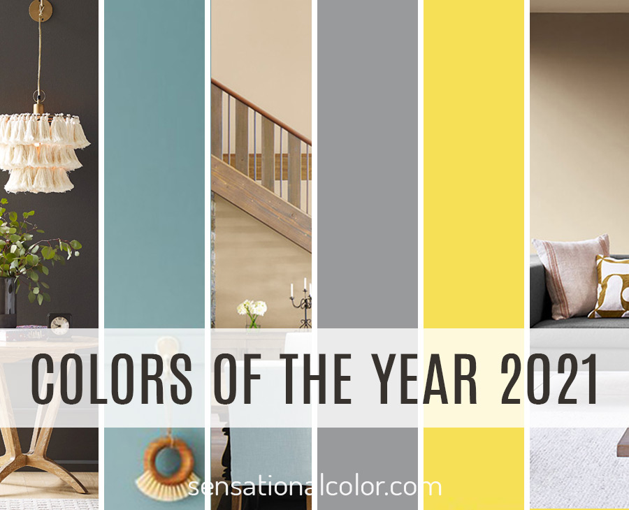
“The union of an enduing Ultimate Gray with the vibrant yellow of Illuminating expresses a message of positivity supported by fortitude. Practical and rock solid at the same time warming and optimistic, this is a color combination that gives us resilience and hope. We need to feel encouraged and uplifted; this is essential to the human spirit.“
On the Adobe blog, Tom Spota, head of motion at Adobe Stock says,"...the color of the year has been illustrating techno-futuristic worlds since the seventies and eighties. “It’s not necessarily a new color to represent digital spaces...This color has been used in cyberspace and metaverse artwork on the covers of novels for decades...I think it's because it's not a color you often see in the natural world. It's synthetic, artificial, but pleasant to look at."
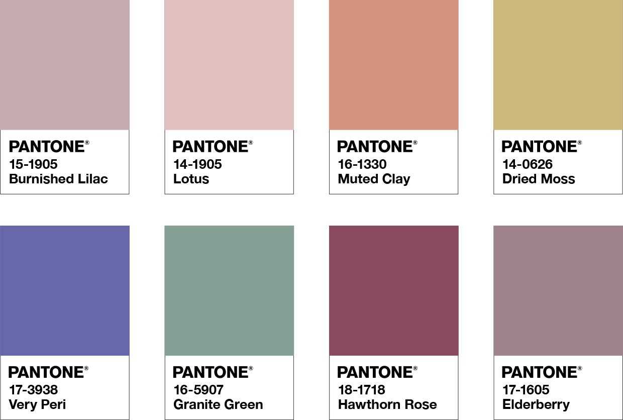
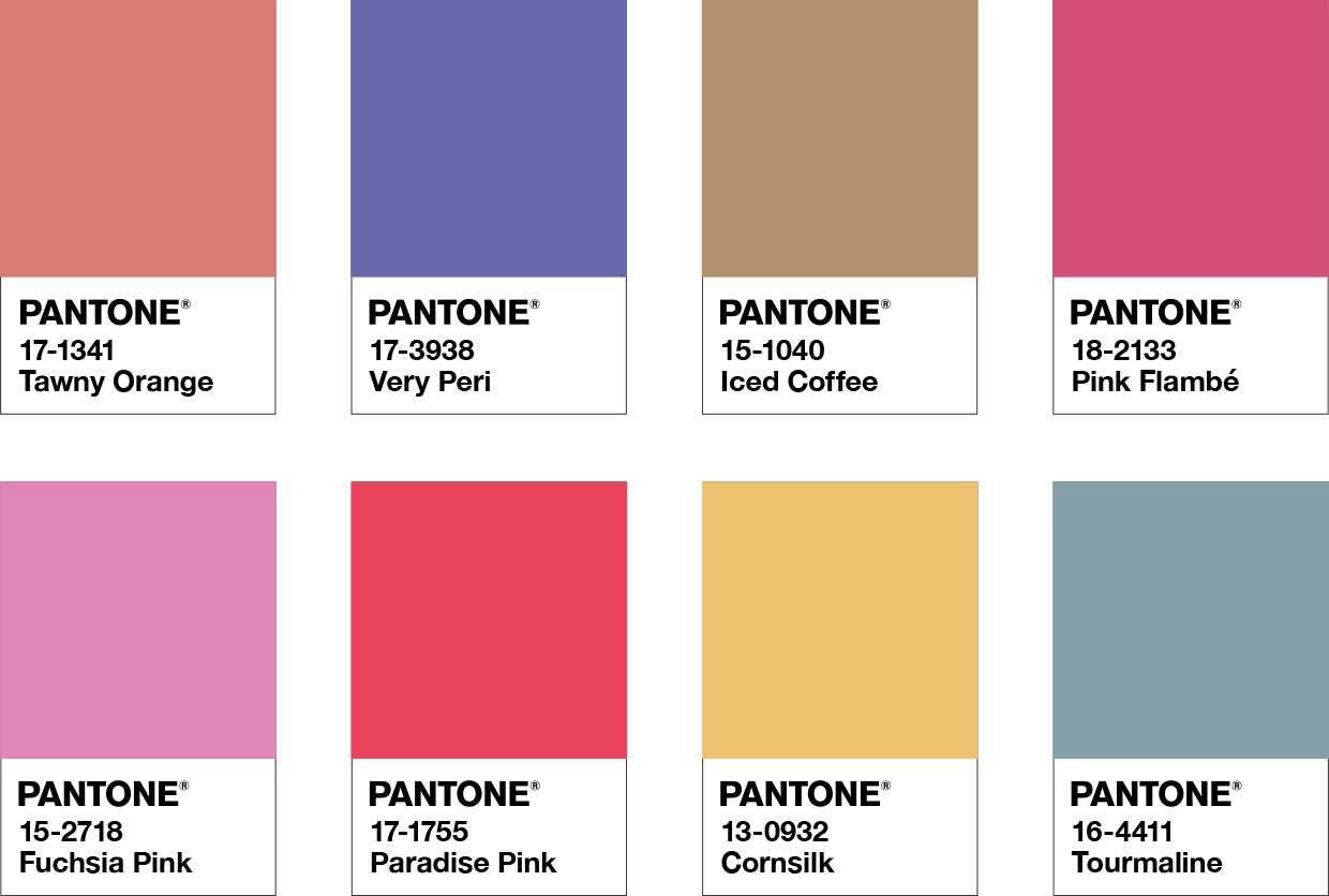
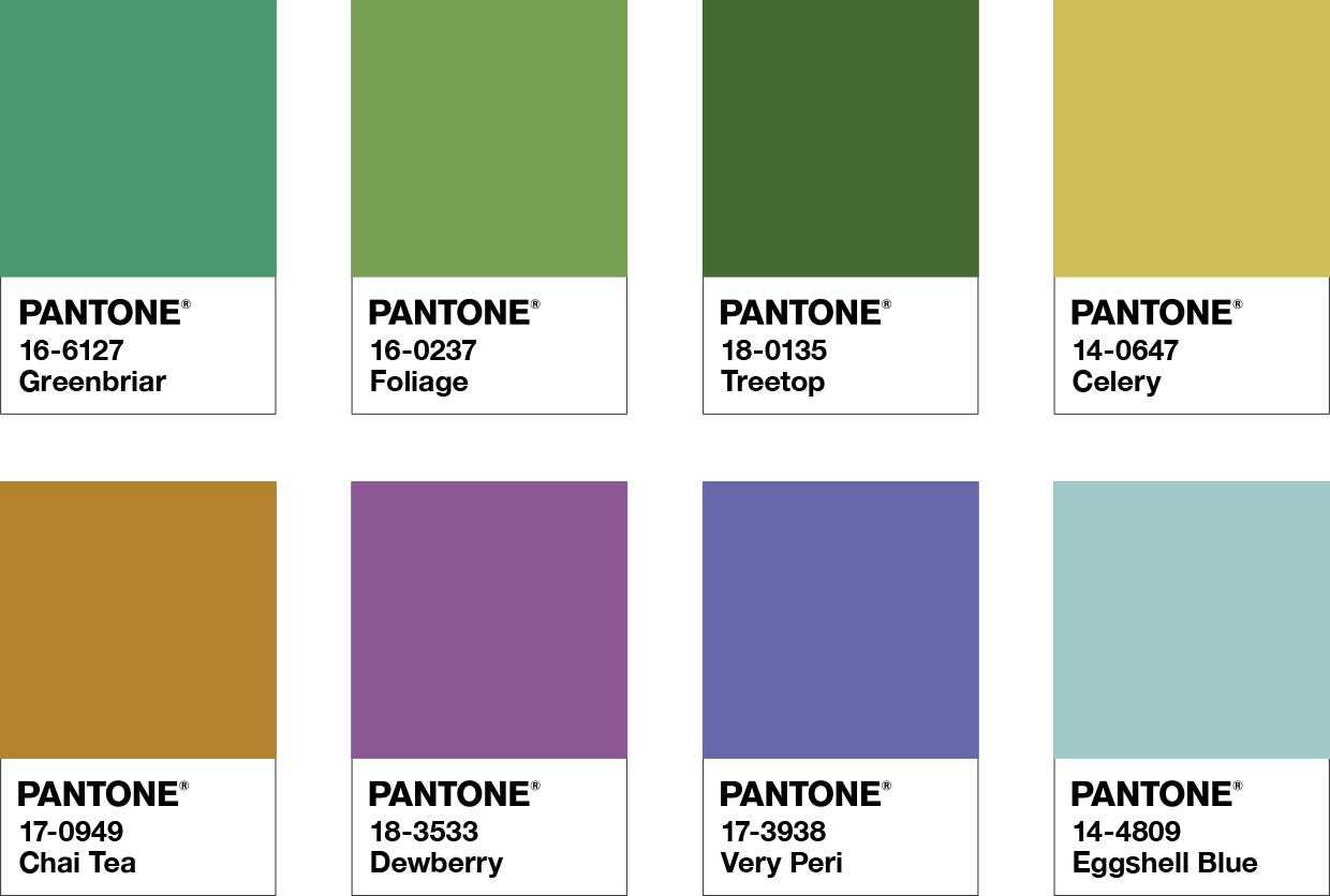
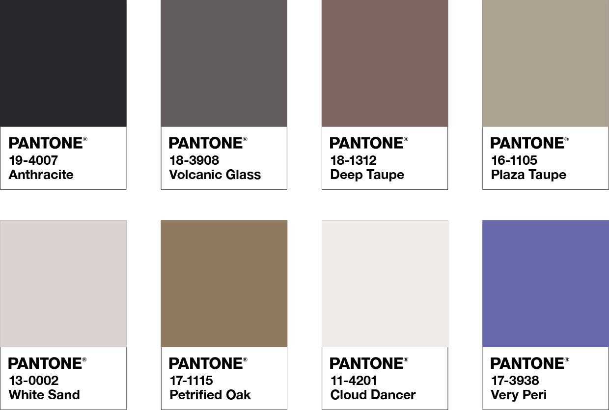
Balancing Act upper left
Balancing Act is a complementary palette of color whose natural balance of warm and cool tones support and enhance one other. The brilliance of PANTONE 17-3938 Very Peri is intensified within this artfully calibrated palette, injecting a feeling of liveliness and visual vibration.
Wellspring upper right
A holistic and harmonious blend of nature infused shades, Wellspring highlights the compatibility of the greens with good-natured PANTONE 17-3938 Very Peri, and the health-giving properties of these deliciously subtle and nourishing hues.
Amusements lower left
Amusements, a joyous and whimsical color story of irrepressible fun and spontaneity is amplified by the carefree confidence and joyful attitude of PANTONE 17-3938 Very Peri, a twinkling blue hue whose playfulness emboldens uninhibited expression and experimentation.
The Star of the Show lower right
The dynamic presence of PANTONE 17-3938 Very Peri comes through in The Star of the Show, as we surround this happiest and warmest of all the blue hues with a palette of classics and neutrals whose essence of elegance and understated stylishness convey a message of timeless sophistication.
A Few Facts About Color Trends
- A Color Trends Forecast is not based on today or even in the past few months. The colors evolve over several years, and when completed, the forecast is a projection of what will most likely be relevant two or more years into the future.
- Trend forecasters first release the colors to industries, giving them a head start on producing products in the new hues. The trend colors are announced to the public less than a year before they hit the market, allowing people to find the colors available to purchase.
- Color trends reflect how people feel and, more importantly, how they want to feel. When designers use colors, they do far more than create a beautiful design. They help their customers evoke those emotions.
- With companies announcing a Color of the Year, many people think that a color trend lasts about 12-months and that color is no longer on-trend. (You can read more about how the life of trends in this post) It may seem that way, but it isn't true. Anything that comes into favor and disappears quickly is a fad. Trends generally last for four to seven years.
- You will see shifts from year-to-year, but you need to look back for four or more years to see more drastic differences in the trends.
What Do You Think About the 2022 Colors? Which Is Your Favorite?
Leave a comment to let me know your thoughts and if you will be using any of these colors in the upcoming year. I always enjoy hearing from you.

thanks for your share. and i think Complementary colors are colors that are opposite each other on the color circle, for example, yellow is complementary to purple.
great i like it
I really like how this post highlights the reasons behind the popularity of green as the color of the year for 2022. The connection between green and nature, as well as its calming effect on the body, are very interesting points. The fact that it can be used in different shades and tones to suit different decorating schemes also makes it a versatile color. I was also intrigued by the choices made by Pantone and Dulux, and how they went in different directions with their colors of the year. It’s fascinating to see how colors can reflect people’s desires and needs. Overall, this is a well-written and informative post.
Hi there, Thank you so much for this helpful information.
You have described the green colour very nicely and it’s shades I have loved your ideas and tones of colours and learned where I can use that tone of colour thank you for this great blog.
Great blog on color trend in year 2022. I really like this article because its also co relate with our life.
Thank. you for this excellent information.