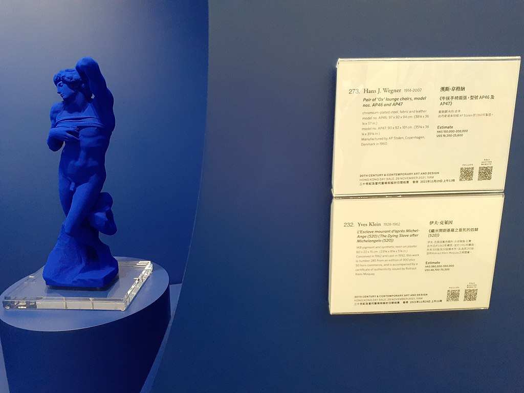
Yves Klein Blue: A Symbol for Global Unity and Cooperation
In a recent interview with the Brazilian magazine Veja, I was asked to comment on the recent emergence and popularity of Yves Klein International Blue on the world's fashion runways. After researching the trend in relation to the latest mega trends and the most recent global color forecasts, I believe that the revival of this intense vibrant blue is one of the leading new color directions today.
The world now faces many issues of sustainability and global cooperation and YKIB is perfect to drive these messages home. What color says global unity and cooperation better than the bright blue that our planet projects when it is viewed from space?
Yves Klein Blue on the Runways
Just like the cycles of our planet, YKIB, last seen in the early 80s, is once again circling through another reincarnation. The color which many call the only patented color is being trotted down the runways in every major fashion capital worldwide. Is this just another recycling of a popular color trend or does it have more meaning and substance this time? Will it have more longevity? The third time may be the charm!
Sustainability, global warming, and the environment are important issues worldwide. Green emerged as the color associate with these issues, YKIB is the color of resolution and cooperation that will define the solutions.

Wikimedia User:TBAOMX 3iiLAU
A Shift in Global Color Direction
Recently global color directions have been associated with regional ethnic colors. It has been a celebration of our global diversity. Now, as we see serious issues like global warming and sustainability are on everyone's mind, there is an increasing need for colors that represent a unified global cause and represent a combined global community. The colors of our planet: vibrant blue, white and green, seem to make the most sense for this global direction. Blue is universally well liked but can also be viewed as ubiquitous and a bit boring. The vibrancy of YKIB makes it exciting and stand out in a sea of blue hues.
Yves Klein Blue: How texture affects our perception of color
in Blue Monochrome
A Patented Color Process
Yves Klein Blue was developed by Yves and his chemists to have the same color brightness and intensity as dry pigments. The color is achieved by suspending dry pigment in a clear synthetic resin. This new medium was patented by Klein. So, the patent is more about the process of suspending the dry pigment in a clear synthetic resin to achieve this very intense blue rather than being a patented color.
What this all means is that to produce a TRUE International Klein Blue, the specific process of dry pigments and synthetic resin must be followed. The majority of manufacturers today use Yves Klein Blue as a color direction and then match it as best they can with their own processes and therefore are not really true patented Yves Klein Blue.
International Klein Blue is one of the few colors that is determined by a patented process, but many brands have trademarked their specific brand colors. One example of a trademarked color would be Tiffany Blue or T-Mobile Magenta.
Color Direction
Context is the key when any color is expressed. The other colors that are in harmony with this direction are equally important. Look for a bright emerald green, a sunny yellow and lots of white to accompany YKIB as a unified and clean color statement.
Could You Wear Yves Klein Blue Everyday?
Valeria “ValBlu” McCulloch - a shoe designer living in New York City doesn't just wear blue but a very specific shade called Yves Klein Blue. She told New Yorker magazine, "Wearing blue for me is being in a dream all day."


