Color Wheel and Color Relationships
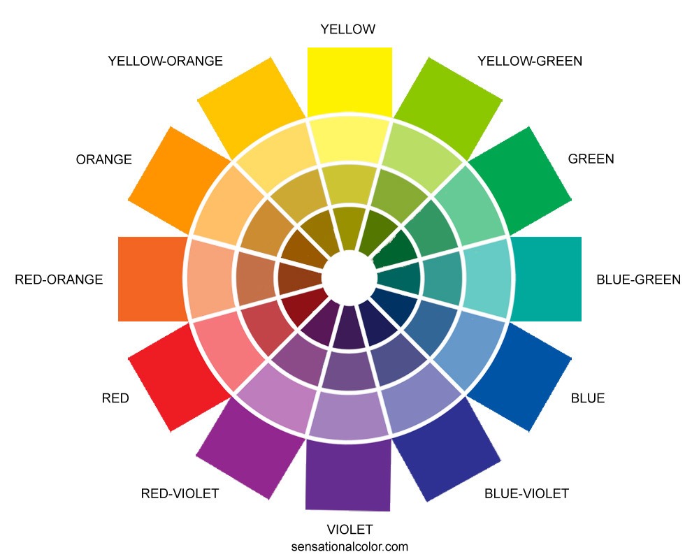
Whether you want to learn to mix paint or put together harmonious color schemes, you must understand color relationships. An excellent way to see color relationships is to look at the color wheel.
The placement of the colors around the wheel is not random. The spectral order (like the rainbow) of colors bend into a complete circle. Each color's placement can help you to identify harmonious color combinations.
What is a Color Wheel Used For?
A color wheel is a tool for organizing colors and understanding color relationships. Think of it as your cheat sheet for creating color harmony. The arrangement of the colors on the wheel gives you a variety of ways to combine hues to create harmonious color combinations. By using the color wheel in this way you can generally select the colors or color families you will use together. When you are ready to select the actual colors, you will use a fan guide, samples, swatches, or online tools that shows you hundreds or maybe even thousands of colors in the material or medium you will be using for your project.
The color wheel is also used by artist and designers as a guide for mixing paints and pigments.
Get to Know the Color Wheel
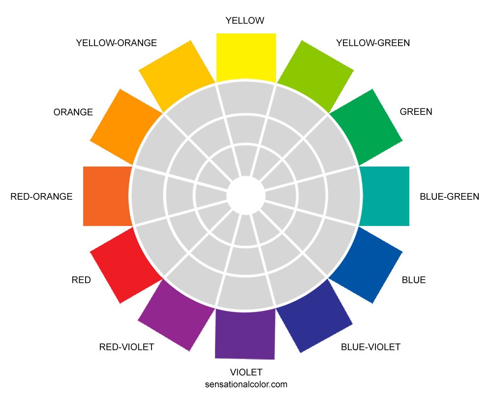
The most common color wheel has twelve sections. A color wheel could have as few as six hues or as many as 24, 48, 96 or more. I find that twelve is the perfect number because the color wheel is not a color selection tool. It is merely a tool for reminding you about color relationships and how to create color harmony.
The quickest way to become familiar with the color wheel is to look at each of its parts.
Hue
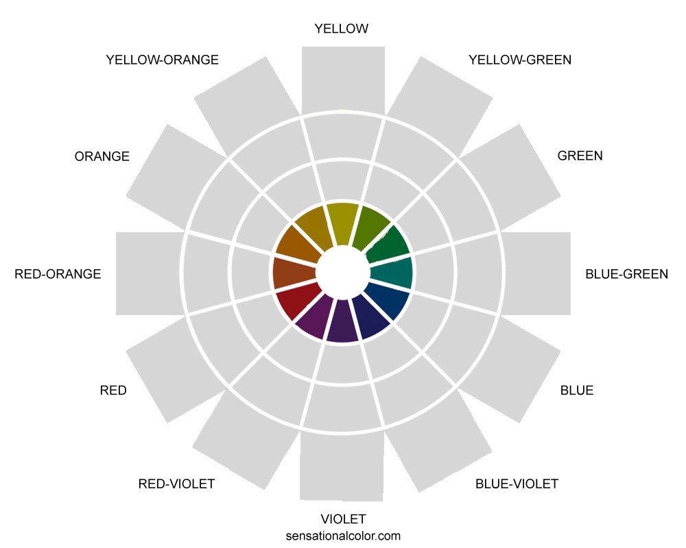
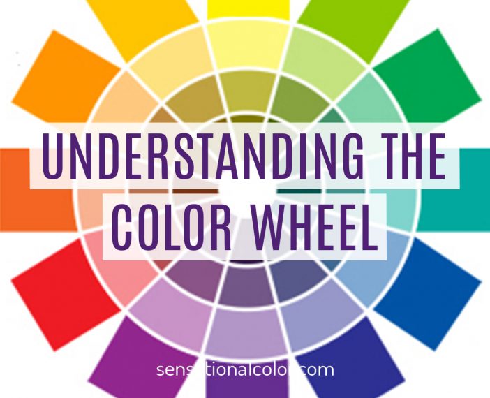
Twelve colors make up the outermost ring of the color wheel. These colors are at their highest chroma and most pure state.
Changing Color Value with Tints, Tones, and Shades
As you'll remember from the last lesson, value refers to the lightness or darkness of a color. The lighter the color, the higher the value; the darker the color, the lower its value.
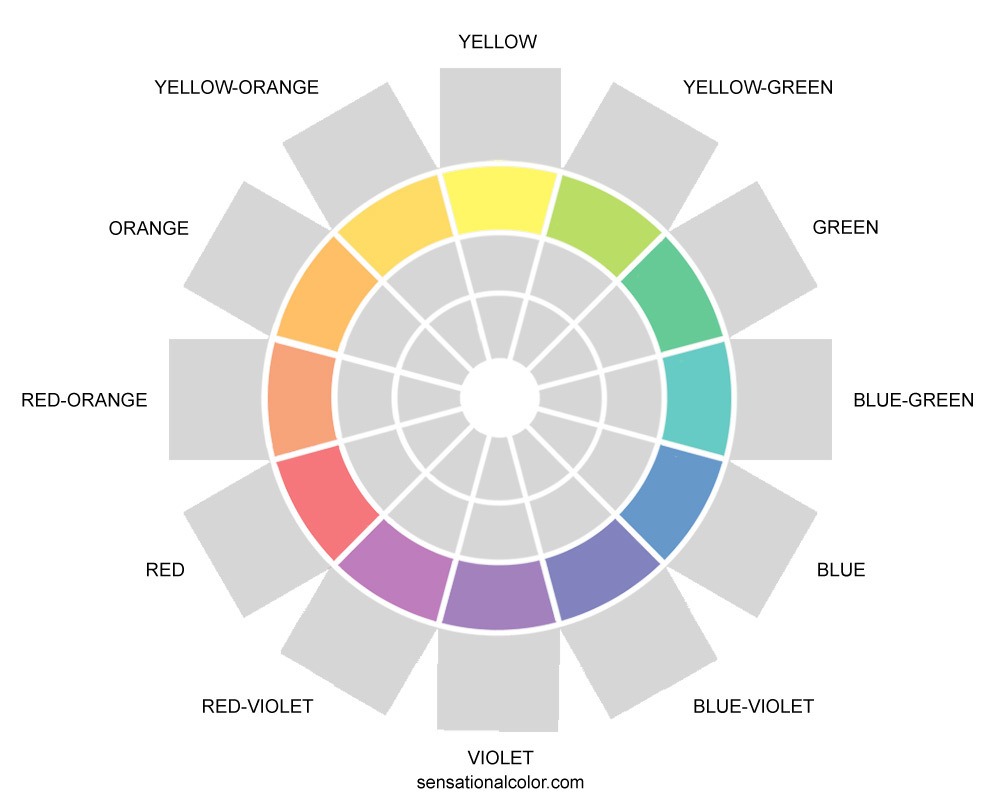
Tint
The lighter value of a color created when a hue is blended with white is called a tint. The hue may be mixed with just a touch of white or with so much white that the hue is very faint but all are tints of the hue. On the color wheel only one tint is shown for each hue. It is the color next to the hue and the tint is made to look like it is midway between the hue and white.
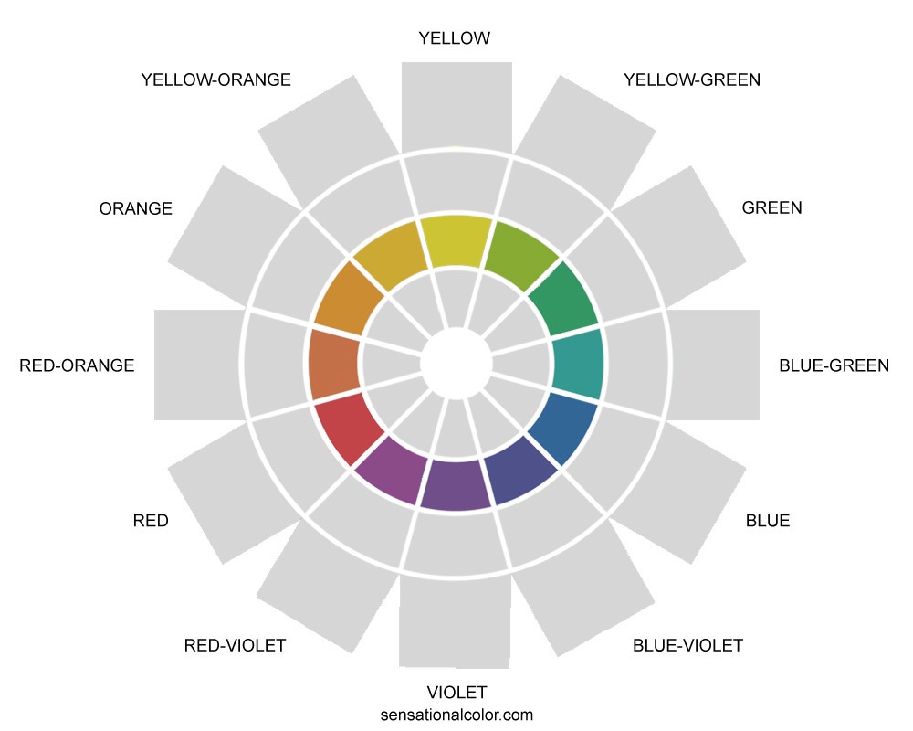
Tone
A tone of a color is created when a hue is blended with gray; adding gray quiets or tones down a color. A hue mixed with any amount of gray is considered a tone. On the color wheel only one tone, which is made to look like it is midway between the hue and middle gray is included for each color.
Shade
A shade is a darker value of a color, made by adding black. Just as with the tints and tones, a hue may be mixed with just a touch of black or with so much black that you are hardly able to detect the hue; all are considered a shade of the hue. On the color wheel only one shade is shown for each hue. The inner most circle includes a shade of each hue, which is made to look like it is midway between the hue and black.

Each of the twelve hues on the color wheel plus all of the many tints, tones, and shades make up the colors on the color wheel.
Color Families
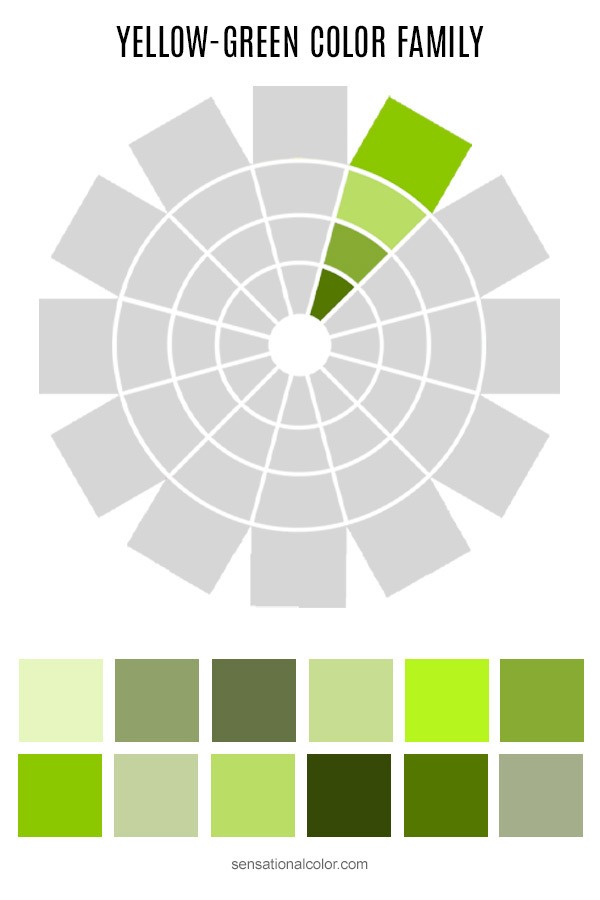
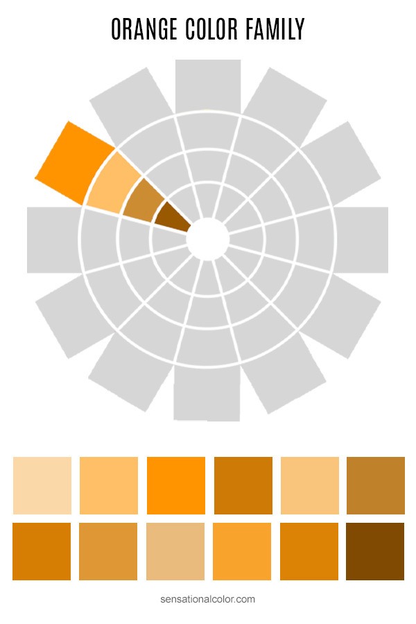
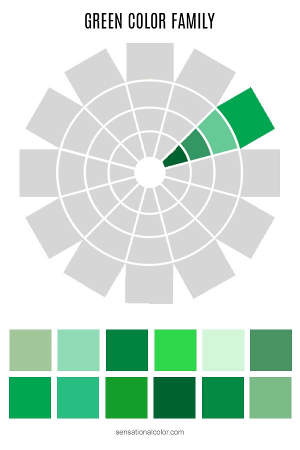
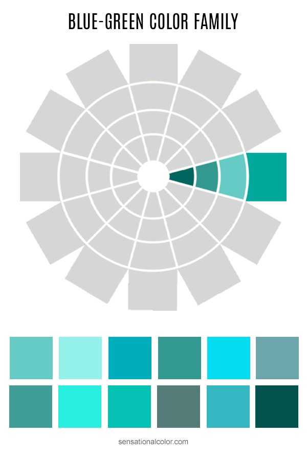
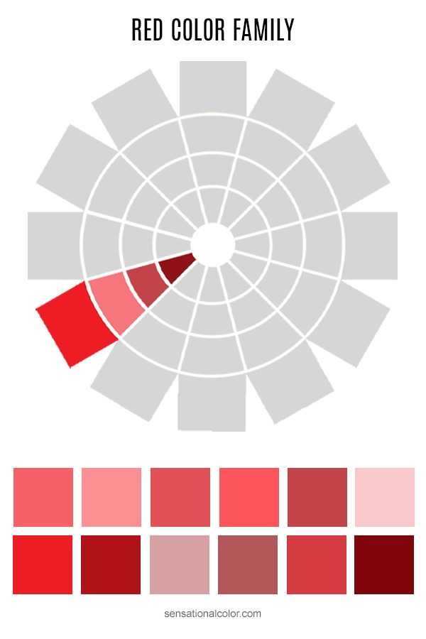
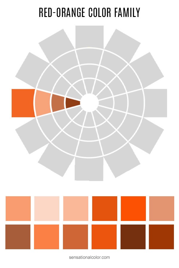
Color Family: Each segment on the color wheel represents the color family of that particular hue. The segment shown on the color wheel above is the yellow-green color family. Remember that only the hue and three variations of it are included for each family, however, they represent all of the many, many variations of each hue.
There are twelve families show on the color wheel, one for each hue. Do you see why I say that the color wheel is not a color selection tool? The wheel can point you to the right color family or combination of colors. When you know what color you are after, you can go to actual samples of the colors available to make you selections.
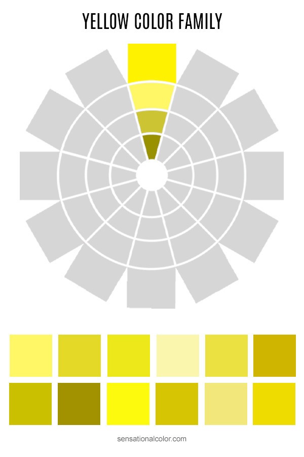
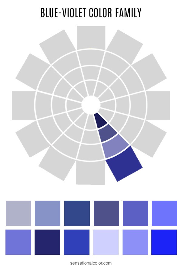
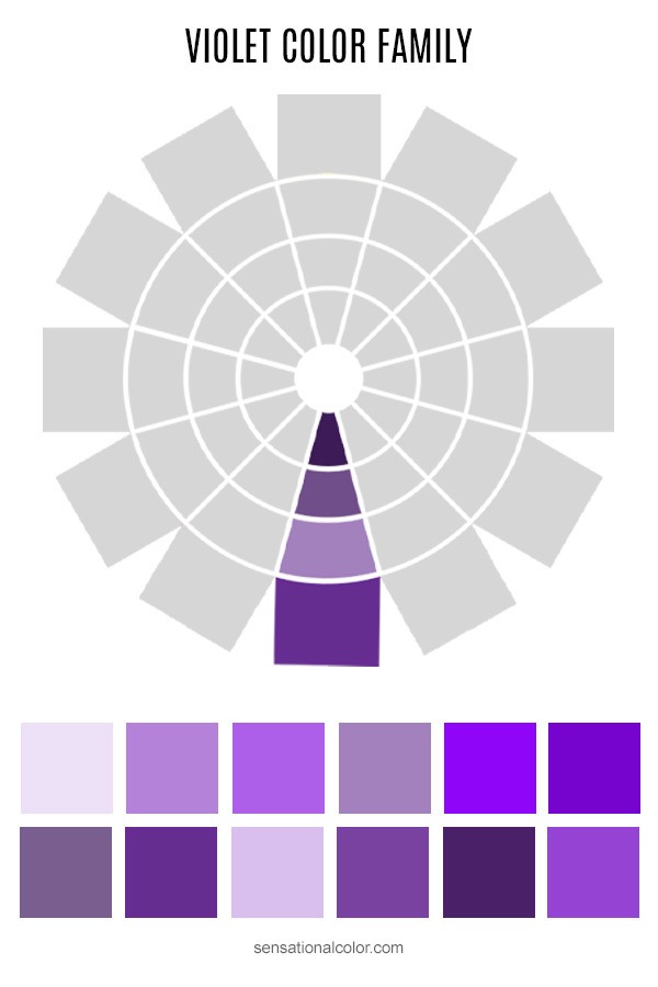
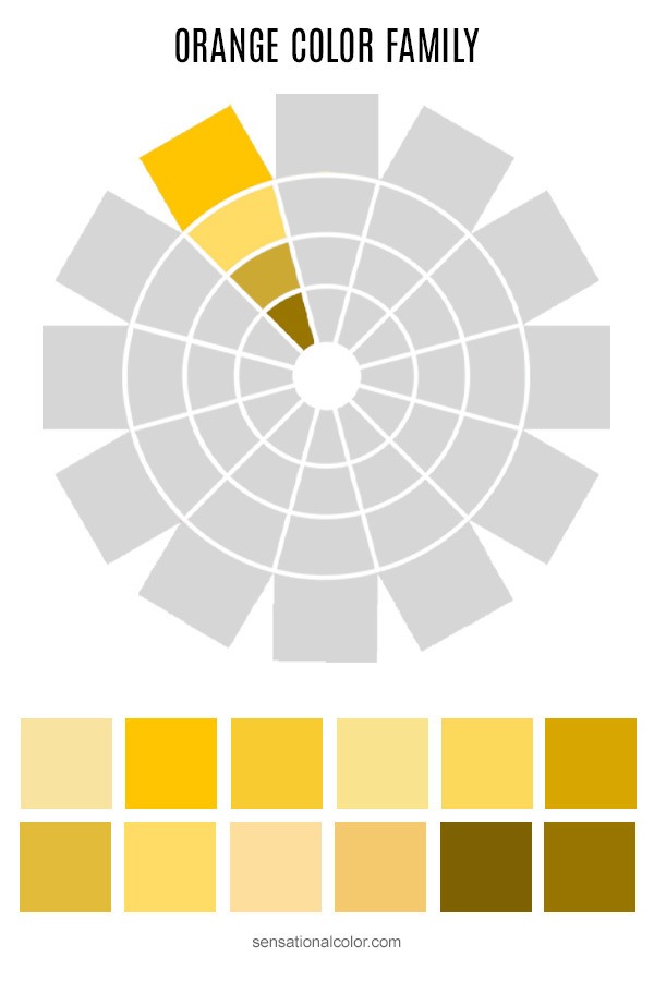

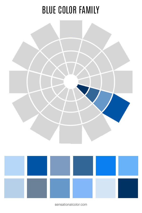
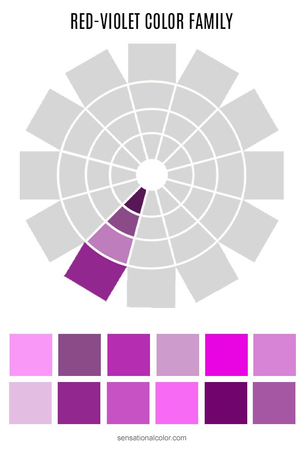
Next, a quick review of the basics will prepare you for creating color harmonies. The twelve hues of the color wheel are primary colors, secondary colors, and tertiary colors.
A Tip for Using the Hand-held Color Wheel
If you look at the color wheel in the same orientation every time, it becomes easier to remember the positions of each color and how they relate to one another. For this reason, I suggest that you get into the habit of holding the color wheel with yellow always at the top. Yellow is the lightest color on the wheel; violet is the darkest. Your mind is comfortable with light being at the top and dark beneath. It is like the earth and sun lit sky. Even at night the source of light is most often coming from above.
The goal is use the color as a reference tool, first by referring to it directly but eventually to see the relationships so clearly that they are stored in your memory as an instant reference for you to access any time you are working with color.
You will find working with color much easier and more enjoyable if you are able to visualize the positions of each color around the wheel and basically know how the colors relate to one another even when you don't have a color wheel right in front of you.
Color Theory Tutorial
Go back to Lesson 1: Hue Value Chroma Explained
You are currently on Lesson 2: Understanding the Color Wheel
Go forward to Lesson 3: Creating Color Harmony
Jump to Lesson 4: Color Temperature
Skip Ahead to Lesson 5: How to Identify Undertones
On to Lesson 6: High Key, Low Key Color Combinations
Appendix 1: Color Terminology Glossary



I didn’t think there would be so many color variations. Thank you for the article and information.
Hello Friends This is a nice article thank you for sharing this article, Wow
Thanks
🙂
Hi
I love working with colours… I colour in my free time and find it very therapeutic. I am a secondary school teacher and find this article informative. THANKS FOR SHARING!!
Thanks for your thoughtful comment, RoseyK!
Thank you so much for breaking this down in an easy, quick absorbing manner. I have had my color wheel for several months but did not know how to approach it and use the tool.
Finally, an easy definition of hue, tint, tone, and shade! I have never been able to get my head around the differences until now. Thank you!
This may be the first time I can say I actually understand how the color wheel is suppose to be used. Thank you!
Lynda, I’m so happy that my explanation could help you to understand the color wheel.
I have been driving myself crazy fighting against instinct. Gray is all the rage today; truth of the matter is it depresses me. I love yellows and golds, even reds. Your information is awesome, and I’m only starting to absorb it!
Thank you very much, Yoli. I appreciate your kind compliment. Kate