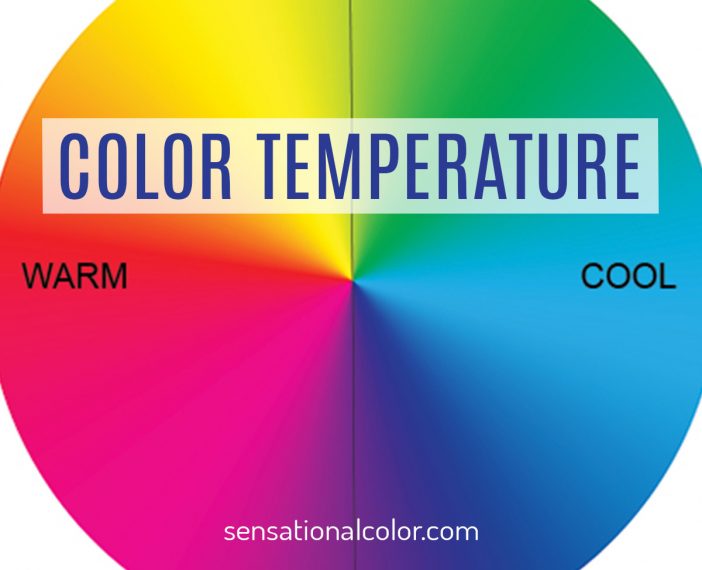
Color temperature describes a color in terms of how "warm" or "cool" it is. Blue, green, and purple are cool colors, while yellow, orange, and red hues is an easy way to explain the concept but there is more to it than that.

When talking about color in design, the terms warm and cool refers not to the physical temperature but to the mood and feelings produced by that color. For example, our experience with blue includes water, wind, and ice. Orange reminds us of the warmth of the sun, fire, and lava. The temperature we associate with each color is universally accepted because it matches our real-life experience with different colors.
While describing color temperature in terms of feelings gets the idea across it can create ambiguity and confusion. The more precisely you can define a color the more effectively you can define colors in a way that removes uncertainty.
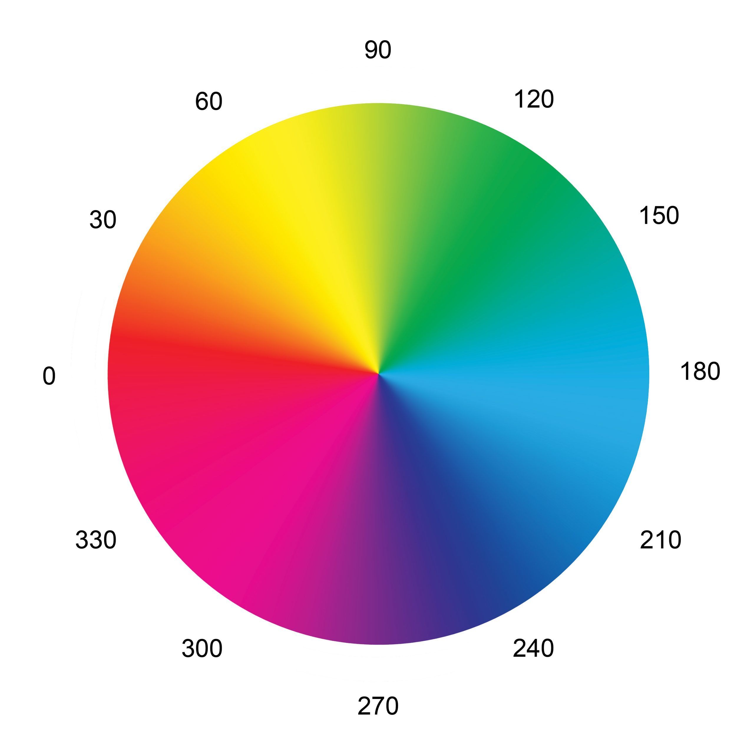
By using the HSL (hue, saturation, luminosity) color model invented for television, the temperature of any color can be defined by a point on the model. A circle has 360 degrees, and thus the scale locates colors as 0 – 359 degrees.
HSL Color Model

Each degree of the HSL system identifies individual colors, but the points noted above can be used to represent color families of the RBY (red, blue, yellow) primaries color wheel and the CMY (cyan, magenta, yellow) printers colors.
- 0 red / red color family
- 30 orange / orange color family
- 60 yellow / yellow color family / printers yellow
- 90 yellow-green / yellow-green color family
- 120 green / green color family
- 150 green-blue \
- 180 cyan blue/green color family / printers cyan
- 210 blue-green /
- 240 blue / blue color family
- 270 purple / violet (purple) color family
- 300 magenta / printers magenta
- 330 blue-red / red-violet color family
Color Temperature on the HSL Model

The absolute value of warm is at 0 degrees. A color cannot get warmer than this red. The absolute value of cool is 180 degrees. A color cannot get cooler than cyan.
You can determine the color temperature of any other colors by its proximity to these two absolutes. Colors that are closer to red than they are to cyan are warm; colors closer to cyan than to red are cool.
By running a dividing line from 90 degrees through the center of the circle to 270 degrees, you can see which colors are warm and which are cool.
Next, let's look at how this division of colors applies to the standard color wheel.
The Traditional Color Temperature Model

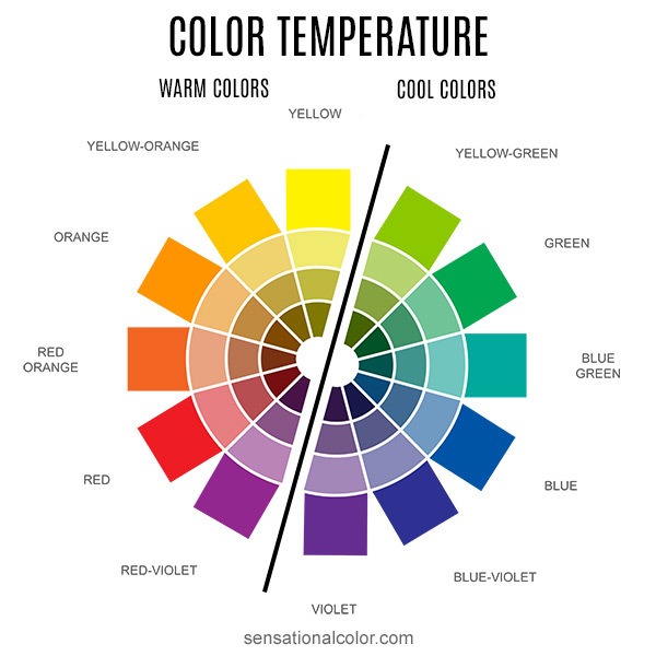
On the color wheel above a line divides it into two even halves - one side for warm and the other side for cool hues. When you see it illustrated like this, it leaves little room for uncertainty about the temperature of a color. Still, based on working with both my students and clients, I have found two things that confuse people about color temperature.
First, because of our strong association with the sun as a source of warmth, many people think of yellow as being warmer than it is, and that can bias their thinking about color temperature.
Second, because yellow-green at 90 degrees, and violet (purple) at 270 degrees, are smack in the middle between the absolute values of warm and cool, it doesn't make sense to define them as warm or cool.
I agree and have found after creating thousands of color schemes that the temperature of violet and yellow-green can be warm or cool, depending on the colors that surround them.
Just because these colors are not warm or cool doesn't mean that they are neutral. Neutral is already an overused word so please don't call these colors neutrals. When you work with color it can be helpful to think of these colors as universal colors that can be used as a warm or cool tone depending on the other colors in the palette.

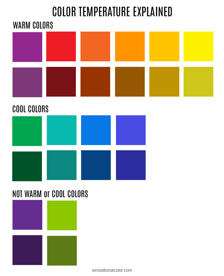
For example, if you choose red paint or a sample of fabric, but it isn't quite right, you would want to find a different red. You could describe the color you desire as either warmer or cooler than the original color. You are only considering the color red, but to find the correct color, it helps to decide if you prefer a red that leans orange or a cooler red that leans violet. Understanding relative temperature can help you to find just the color you have in mind more quickly.
The same is true for blue. All of the blue squares are considered cool, but when comparing blue to blue-green, the blue-green is moving towards yellow and thus is warmer than true blue.
Please note that cyan is cooler than blue as you saw above on the HSL wheel above. However, since the common belief of most of your customers is the blue is the coolest color, you may add to their confusion in selecting a color if you say cyan or blue-green is cooler than blue. As a colorist, however, it is essential that you understand color temperature correctly.
In the case of yellow, a shade that had more green is cooler than one that has more orange.
Two red squares can be labeled as warm when speaking in terms of all colors. However, when comparing one of the red squares to the other, a red that leans violet is cooler than one that leans orange.
How Color Affects Spatial Perception
In addition to the various physiological and psychological effects, warm colors optically seem to advance and expand while cool colors recede and contract. Artists use color temperature to help give paintings, especially landscape paintings, a sense of depth and space. You will often see that the colors of objects that they want to appear closer to the viewer are more colorful and warm while the background is more neutral and cool.
In addition to color temperature, you must also consider the chroma (intensity), and value of the color as well as how a color contrast to surrounding colors that will affect spatial perceptions.
Using color temperature in interior design to create spatial effects is not as simple. I will not go into that here but if you are interested in color for interior spaces, I explore the idea in more depth in my Confidently Selecting Interior Colors course.
Color Theory Tutorial
Go back to Lesson 1: Hue Value Chroma Explained
Go back to Lesson 2: Understanding the Color Wheel
Jump back to Lesson 3: Creating Color Harmony
You are currently on Lesson 4: Color Temperature
Move Ahead to Lesson 5: Understanding Undertone
On to Lesson 6: High Key, Low Key Color Combinations
Appendix 1: Color Terminology Glossary


Great comprehensive tutorial with excellent examples. Consider adding section for camera temperature settings of light.
I am a watercolour painter and tutor and often find people are confused by the warm and cool analogies of colour, often because it is relative? One thing I was confused about in this article was that you described a blue green as leaning more towards warm than a true blue because it has more yellow in it? However in the next paragraph you say that cyan ( a green blue) would be considered cooler than blue?
This is the problem when relating to warm and cool. Red is warmer than yellow so as blue moves down the colour wheel the red/purple content increases and the yellow green content decreases so in terms of painting for sure the greener blues become cooler, while the red/purple blues become warmer.
In my classes I teach colour mixing by asking the students to see which secondary the primary veers towards…if it is a greener blue and a greener yellow, the resulting mix will contain more green and therefore produce a very bright green, rather than mixing a blue which veers toward purple and a yellow which veers towards orange producing a very muted green. They seem to understand that concept more easily than the concept of colour temperature.
This article appears to have 2 technical errors:
– “violet (purple) at 90 degrees”; according to the HSL graphic, violet is at 270°; even if one were to orient the polar coordinates to be 0° at yellow-green, violet would be 180°, not 90°.
– “…you must also consider the intensity, chroma, and value of the color…” In article 1 of this series, the author says “Chroma, intensity, and saturation mean slightly different things. The human eye does not easily detect the differences, so these terms are all ways of describing *the same characteristic* of color. ” [emphasis mine] If Chroma and intensity are interchangeable for practical use, why are the two terms contrasted in this article? Wouldn’t it make more sense to say just “you must also consider the chroma and value of the color”?
You are correct. That is a mistake and I will fix that now.
Yes, I could use just chroma but since people are not often familiar with this term, I included both. Perhaps putting intensity in parenthesis would make more sense.
Thanks for you helpful comments.
So, what’s the scale that’s perpendicular to Warm-Cool? By “perpendicular”, I mean what’s the scale in which Red and Cyan are in the middle just like how Chartreuse and Violet are in the middle of Warm-Cool?
There is not a term commonly used to define that axis.