Each year some of us celebrate the new year by looking back over events of the year just past. Others ring in the new year with a commitment to a healthier diet, regular workout routine and a new pair of yoga pants. For companies that sells color "out with the old in with the new" is marked by announcing a color of the year.
In 1990 Pantone, the global color matching company, announced their first color of the year and since then many other companies have followed suit. The color of the year represents the hue that the color gurus at each company feel will influence design over the next 12 months. So with so many different colors being named what color is the real color of the year? The answer lies in how you plan to use the color.
Here is a look at the color of the year as predicted by five top color companies in the same order that they released their Color of the Year 2015 to the world -- Akzo Nobel, Benjamin Moore, PPG Pittsburg Paints, Sherwin-Williams and Pantone.
Akzo Nobel Color Of The Year 2015 Copper Orange
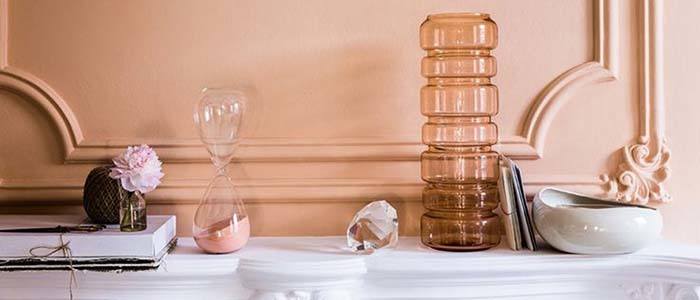
"We are learning to look at the world around us in new and unique ways. The overriding idea for 2015 is that people are finding new ways to add color to their lives and are developing a warmer and more caring environment for all." -- Heleen van Gent, Creative Director of AkzoNobel's Global Aesthetic Center
AkzoNobel is a global colors and coatings company headquartered in Amsterdam, the Netherlands. Now in its 12th year of producing the Colour Futures report, trend and color forecasting has become a vital part of their business. Their research, which is informed by both the design industry and consumer behavior, is generally spot on for what is important in Europe or areas influence by European trends.
They were the first to announce their color of the year, Copper Orange. This color was selected by an invited panel of independent design and color experts following in-depth research into emerging worldwide trends.
While AkzoNoble focuses on color for lifestyles and living environments, this color has a strong appeal that will likely be picked up by designers across industries. I liked this color the moment I saw it and now after considering all of the others Copper Orange is still my all-around favorite.
Benjamin Moore Color of the Year 2015 Guilford Green
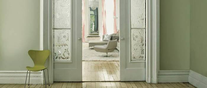
"A neutral that's natural. A silvery green that works with, well, everything. No worries. No second thoughts. Just a brush, dipped in a can, whooshed on a wall, and a whole lot of happily ever after." --Ellen O'Neill, Creative Director, Benjamin Moore
Benjamin Moore, a North American paint brand was the second company to release their 2015 Color of the Year - Guilford Green. In their press release the hue is said to be "a stunning silvery green that complements both modern and traditional styles" and I agree with all but the term "silvery" to describe this color. I think to most this would call to mind a cooler green than this neutral that leans more towards the warm side of the greens.
That being said I do think this is a very timely choice for home interiors and exteriors. It connects the home to nature and gives it feelings of vitality, energy and growth. Guilford Green is a very livable color that works well with every style of home. The company said the Guilford Green was chosen "because it can be the hero or the highlight in any room." I expect we will see this and similar warm neutrals being used with a variety of colors from their collection, which features four gorgeous color families - green, blue, blush and berry. The bold, more saturated hues represent an evolution from the soft pastels that comprised Benjamin Moore's Color Trends in 2014.
PPG Pittsburg Paints Color Of The Year 2015 Blue Paisley
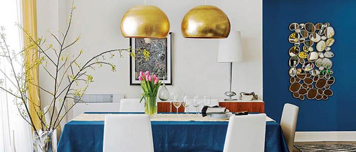
“In observing the purchase behavior of homeowners, a single overarching idea became evident – we are now looking to set the tone for the year ahead using vibrant yet stylish colors that play off our unique experiences and tap into our desire for global eclecticism that mixes natural and manmade themes.” -- Dee Schlotter, National Color Marketing Manager, PPG Pittsburgh Paints program.
Blue Paisley was announced as PPG Pittsburg Paints 2015 Color of the Year. Experts from PPG Industries anticipate this lavish, almost-but-not-quite royal shade of blue to play a prominent role in the home décor trends for the coming year as homeowners look to positively influence their lives and decisions with vibrant hues.
Homeowners are finding home décor inspiration across the globe and from varied time periods. Selecting colors that signify a global eclecticism, such as Blue Paisley can transform a home into a glamorous fusion of worldly possibilities. It is an perfect exterior color on a front door or shutters. For interior schemes this color can be used as a main color to make a big statement or as an accent color to invigorate less lively hues.
PPG’s color stylists from around the world collaborated to form the overarching idea behind their four new palettes – setting the tone for the entire year ahead. From these colors their choice for color of the year was clear when they considered the popularity of the blue across all markets, such as home décor, automotive and electronics. I also see this continuing to be used to add energy to fashion, graphics, action & recreation and print/media palettes.
Sherwin-Williams Color Of The Year 2015 Coral Reef
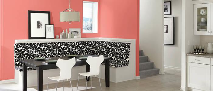
"Its (Coral Reef) unexpected versatility brings life to a range of design aesthetics, whether traditional, vintage, cottage or contemporary. Simply add this carefree color to your home’s palette and watch your creativity blossom.” -- Jackie Jordan, director of color marketing, Sherwin-Williams.
Perfectly suited to celebrate a mid-decade year that’s poised for revitalization, Coral Reef is Sherwin-Williams Color of the Year 2015. The uplifting, vivacious hue with floral notes is the perfect mélange of pink, orange and red that can be used to liven up any space.
Coral Reef is similar to Cooper Orange but more energized. It is a color that can stand beautifully alongside, white, black and warm neutrals or other lush flower-garden hues. For vintage quality that’s hard to beat, Coral Reef and aged matte brass make a perfect pair.
Each year, Sherwin-Williams color experts research color influences from around the world to determine the annual color forecast and the Color of the Year. This year they chose a color that has been popular in fashion trends, Coral Reef. The believe that this upbeat hue embodies the cheerful approach to design that Sherwin-Williams color experts see as being important in the coming year.
Pantone Color of the Year 2015 Marsala
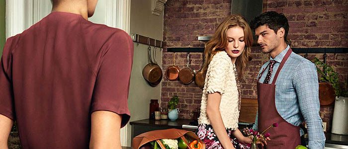
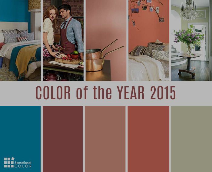
"While PANTONE 18-3224 Radiant Orchid, the captivating 2014 color of the year, encouraged creativity and innovation, Marsala enriches our mind, body and soul, exuding confidence and stability." -- Leatrice Eiseman, executive director of the Pantone Color Institute
Pantone has always been the last to announce their color of the year. Usually that strategy earns them "you saved the best for last" accolades from the majority. This year however Marsala landed with the thud of many negative reviews. Some simply said, "Yuck!" while others said that the color evoked thoughts of rust, the grimy, gag-inducing type that lines corners or frat boy dormitory-style bathrooms. Or blood, the freaky dried kind whose iron content has been exposed to the air long enough to evoke a dull brick.
I can understand the reaction. Marsala is a color that without context or a sensous finish doesn't possess the power to seduce. However, when the application is right this ugly duckling emanates sophistication and richness.
With its burnished undertones, sultry Marsala pairs fabulously with amber, umber and golden yellows, greens in both turquoise and teal, and blues in the more vibrant range. Complex and full-bodied, Marsala can provide a unifying element for interior spaces. Rich and welcoming, this hue can be incorporated into any room in accent pieces, accessories or soft furnishings.
I think my favorite application for Marsala is going to be in graphic design. It is a color that is equally at home going high-end or low-tech making it a perfect partner for graphics, packaging and print media.
What Is Your Choice For Color of the Year?
Which of these colors represents the hue that you think will influence design over the next 12 months.? Do you plan to use any of these colors? How will you use them?


Kate, I really like the copper orange. It’s warm & yet I think it will pull together many textures and especially the metallics that are still so popular. I’m going to explore if it will hide the gold finish in my new master bedroom which I detest, but if I don’t see it … then I won’t have to remodel the room right away.
Let me know how it works in your bedroom, Tina.
There sure was an awful lot of hubbub over Pantone’s Marsala. It’s growing on me…and I think you’re spot on about the pairings.
PPG’s Blue Paisley is my favorite on the list.
I love all the colours, but I am Ooohing and Ahhhing over Copper Orange.
Kate —
Thank you very, very much for this article!!! Sharing with folks that more than one company selects a color of the year, will be, by itself, the biggest “Aha” out of this article. I have always appreciated that fact, but it is obvious that not all companies have the same PR effort to announce their color of the year. Dare we even let folks know that some organizations create whole palettes of the year, or would that be way too confusing???
Thanks Marvin. I think it would be good to share each companies trend reports. I’ll add the links.
It does seem that Pantone is regarded as the strongest authority. It’s so interesting that these colors are all so varied, but actually I think you could combine all 5 of these in many varied and interesting ways. 2015 is going to look nice!
I can see that too, Nellie. I think these will combine in some very interesting ways.
I like each of these for different reasons. I do agree about having a negative first reaction to Marsala, but will look at some of your ideas about pairing it with something that reveals its richness.
As a home interior painter I have used similar paint colors to Marsala. You can see some similar paint colors from paint manufacturers on thepaintedsurface.com – 2015 Color of the year
Yes, many companies have colors similar to Marsala available right now.
Marsala will really look great with all the grays that have been growing in popularity across the country. Many homeowners already have some marsala in their existing “traditional” decor. Pairing with gray makes for a great segue into a fresh contemporary direction for homeowners without feeling as though they must throw everything out and start over to be more on trend. Hooray, a cost savings!
Good points, Susan. Thanks for sharing.
Lovely color but I have to wonder if Marsala signals a shift from the last decade of white and gray tones? Will we start to see more warm tones, richer browns? Will the gray and white kitchens we just installed suddenly date our houses (Oh, that white kitchen with gray marble counters is from pre-2015). Marsala would be pretty next to the “new” brass making a comeback.
We are seeing colors go warmer but gray is not gone. Brown and gray are going to live/work side-by-side…at least for the near future.
Nice warm colour wine red is. Gives life to walls when used and the flexibility to make fabulous combinations with other colours.
Amazing!!
I can’t wait to see the creative combinations as more designers begin to use this color.
Rich! Earlier I wouldn’t have know “Marsala” if it stood up an whacked me. Thank you for introducing me to this absolutely warm color. I’d love it on home furnishings … may be accent pieces teamed with beige? But I’m foxed by the various tones of this color. I’ll simply have to bookmark this article so I won’t look like a fool when I discuss Marsala. And what a sexy name too.
Thanks for the comment. It made me smile.
Love the richness and tonal color – interested to see how this translates into spring and summer living.
I like the deep, rich versions of this color and I’m looking forward to see how this shows up in all kinds of design.
Just yesterday, I read on a decorating blog that the choice would likely be “Guilford Green” or “Paradise Blue”. I didn’t like either one, but Marsala is gorgeous!
Benjamin Moore’s Color of 2015 is Guilford Green and Blue Paisley was named 2015 Color of the Year by PPG Voice of Color. What color is “the” color of the year? It really depends on who you ask
What would be the Benjamin Moore color for Pantone Marsala?
I haven’t pulled out the decks to make a match but it put me in mind of their Maple Leaf Red 2084-20 or Hot Apple Spice 2005-20.
In the 2015 trends report, Benjamin Moore has a color similar to Marsala that leaned more purple — Caponata AF-650
I like Marsala so much better than the previous colors, especially Radiant Orchid. A color that we can actually use and be inspired by for interiors. Works well with ethnic influences as well.
You are right Nancy. This color works with ethnic influences very well.
I love the beauty and depth of the rich color, Marsala. It will be widely embraced here in the mid-west which means we’ll be trend-setters rather than trend-followers for a change. Thanks for sharing it so quickly!
You’re very welcome, Jan. I agree — always more fun to be a trend setter rather than followers.
I love the warm, earthy feel of Marsala, yet rich and sophisticated too! It happens to be my favorite shade for lips and nails. This hue will play a great role in accessorizing, whether fashion or interior. I think it will also be fabulous as a textured, brocade type linen.
Good points, Nancy. I think the finish and texture will be important to this color having longevity.
I love this color – rich and beautiful and warm. I sincerely disliked Emerald (2013) and wasn’t wild about Radiant Orchid (2014). I this Marsala will be able to be used in a variety of industries easily; fashion, furniture, interior design etc.
I wasn’t a big fan of either of the past two picks. This color has more promise.