What do you think of the Color of the Year for 2019?
The answer depends on which color you consider the Color of the Year.
A decade ago, the color Pantone put forth was the one that most people thought of when they heard "Color of the Year." With many other companies jumping on this idea, Pantone’s pick is no longer the first color that comes to mind for many.
Today a color that was chosen by Sherwin-Williams, Benjamin Moore, Pittsburgh Paints, Akzo Nobel, Behr or another company is likely to be the one a person remembers. These companies have done a great job of marketing their respective color of the year. While marketing is important. I think that other factors are equally influential.
The connection you have to a brand and the relevance of the product play a role. Outside of the design and product development fields, not everyone knows Pantone or has a need for what they offer. While at some point, almost everyone needs paint and most people are familiar with one or more paint companies; some even have a strong loyalty to a particular brand.
It is this familiarity with both brand and product that has given paint companies the ability to have their color of the year top of mind for many consumers. So, despite Pantone’s best efforts to be recognized as the color authority, paint companies have an inside track to a majority of consumers.
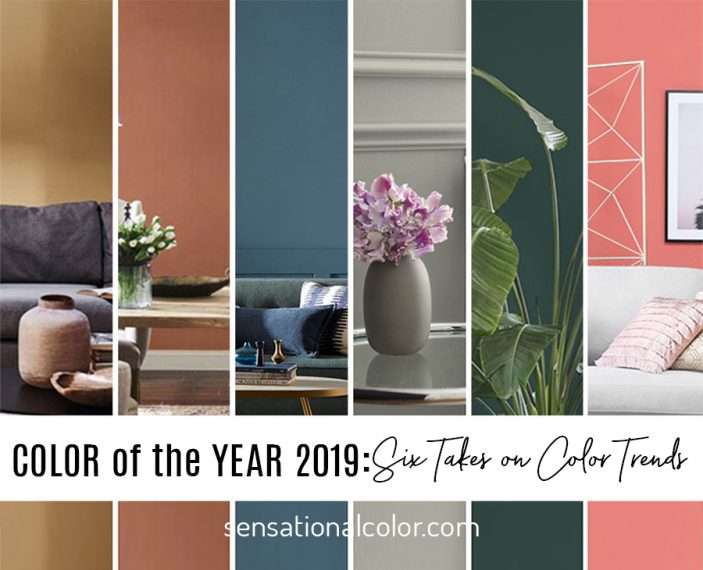
Let’s look at the top six hues named as Color of the Year 2019. The colors are listed in order by the date the colors were announced. I’ve included a snippet of what each company had to say about their choice followed by my thoughts on each.
PPG 2019 Color of the Year Night Watch PPG1145‑7

Classic luxury meets the restorative power of nature in this trending deep green paint color.
Night Watch is a rich, luxurious, and classic shade of green allowing spaces to emulate the feeling of lush greenery and the healing power of nature. “The restorative power of nature is important in society now more than ever,” explains Dee Schlotter, PPG senior color marketing manager. “Night Watch is about bringing the healing power from the outdoors into your home through color. The dark green hue pulls our memories of natural environments to the surface to recreate the calming, invigorating euphoria we feel when in nature.”
Any color that blends blue and green catches my eye, and this cool deep green is no exception. It is a luxurious hue that can be paired with everything from unfinished woods to shiny or metallic finishes. Dark wall colors have gained in popularity but if a deep shade isn’t right for your space, add just a small bit of this rich green. It can work into almost any decorating scheme. Think of Night Watch as adding a dark note to your current color harmony. I recently added a few Hall China bowls in this color to the open shelves in my kitchen. Where might you add some of this gorgeous green?
See all of PPG’s trend colors for 2019:
https://www.ppgvoiceofcolor.com/trends/we_are-color-trends
Behr 2019 Color of the Year Blueprint S470-5

A mid-tone blue that charts a course for people to reimagine the colors and design of their home.
"Much like the sketches builders rely on to bring an architectural design to life, Blueprint S470-5 lays a foundation for consumers to make their unique vision a reality," said Erika Woelfel, vice president of color and creative services at Behr. "This universally appealing hue provides a steady stream of positivity and is poised to be an instant classic for years to come."
The chalky blue is an evolution of a color that continues to be strong again this year. I can imagine this color in any interior space as well as on a home’s exterior. It is a blue that is on the warmer side of denim and less formal than navy blue. Blueprint is a color that speaks to our desire for authenticity, honesty and connection. If you’re feeling blue this year (as in adding it to your color palette, not feeling sad), this is a beautiful blue to go with.
See all of Behr’s trend colors for 2019:
https://www.behr.com/consumer/inspiration/2019-color-trends/
Akzo Nobel / Dulux Color of the Year 2019 Spiced Honey

People around the world are experiencing a renewed sense of energy, optimism, and purpose. Spiced Honey reflects those desires.
“Spiced Honey has a warm amber tone which perfectly captures our “Let the light in” theme. It can be calming and nourishing or more stimulating and energizing, depending on the light and colors surrounding it. Truly versatile and contemporary, our Color of the Year 2019 complements a broad spectrum of lifestyles and interior styling and is the ideal choice for reflecting our new sense of optimism. Last year, many of us were left unsettled by global events, so we closed our doors to retreat and regroup. Now we feel ready to open our windows and let the light in.”
The golden glow of Spiced Honey walks the line between neutral and color making it a versatile addition to your home. This warm, natural hue feels fresh yet at the same time classic and timeless. Are you feeling the need for more joy and happiness in your life? Begin by updating your "happy place" at home.
See all of Akzo Nobel’s trend colors for 2019:
https://www.akzonobel.com/en/colourfutures/colour-of-the-year-2019
Sherwin-Williams Color of the Year 2019 Cavern Clay SW7701

Forged by sun. Fired by desert. Ancient, yet fully alive. Bohemian, yet totally refined.
“A warm terracotta color with ancient, elemental roots, Cavern Clay is a nod to midcentury modern style, but with the soul of the American Southwest, which together creates the modern desert aesthetic,” she notes. “Cavern Clay is an easy way to bring the warmth of the outdoors in. Envision beaches, canyons and deserts, and sun-washed late summer afternoons—all of this embodied in one color,” according to Sue Wadden, director of color marketing, Sherwin-Williams.
Cavern Clay is a versatile color that I used in my own kitchen in one of my last homes. The kitchen cabinets in the newly built house I was about to purchase had a slight peach undertone. Surrounded by Cavern Clay, the finish appeared as a neutral, light wood tone and I fell in love with how this earthy orange looked on the walls. Many others did, too, and I was often asked to reveal the brand and color number. I expect that today many people will be attracted to this color reminiscent of baked clay. Pair with denim blue, worn leather, and woven textiles for an authentic western look or go with a retro-inspired scheme to create a mid-century vibe.
See all of Sherwin-William’s trend colors for 2019:
https://www.swcolorforecast.com/
Benjamin Moore 2019 Color of the Year Metropolitan AF-690

The hue that's set to define interiors next year as homeowners opt for a narrative of adaptability, balance and modest allure.
"Comforting, composed and effortlessly sophisticated, Metropolitan AF-690 exudes beauty and balance," said Ellen O'Neill, Benjamin Moore Director of Strategic Design Intelligence. "It's a color in the neutral spectrum that references a contemplative state of mind and design. Not arresting nor aggressive, this understated yet glamorous gray creates a soothing, impactful common ground."
Metropolitan fits squarely into what I call the “Disconnect” palette for 2019 – At the intersection of high-speed connections and calm minds, we find inspiring neutrals that have an almost magical ability to blend with an unlimited range of colors and look fabulous in every finish from shiny and metallic to flat or matte. It is interesting that more than half of all of the colors in the Benjamin Moore 2019 trend palette primarily address this one aspect of what is driving trends. Perhaps their trend team has a stronger desire than most to “capture the coveted feeling of restorative quietude.”
See all of Benjamin Moore’s trend colors for 2019:
https://www.benjaminmoore.com/en-us/color-overview/color-palettes/color-trends-2019
Pantone Color of the Year Living Coral 16-1546

An animating and life-affirming coral hue with a golden undertone that energizes and enlivens with a softer edge.
"Color is an equalizing lens through which we experience our natural and digital realities, and this is particularly true for Living Coral," according to Leatrice Eiseman, Executive Director of the Pantone Color Institute. Living Coral emits the desired, familiar, and energizing aspects of color found in nature. In its glorious, yet unfortunately more elusive, display beneath the sea, this vivifying and effervescent color mesmerizes the eye and mind.
This jazzy pinky-orange is a blend of fun, warmth, energy and a dash of nostalgia. It falls into what I call the "Reconnect" trend -- happy, nurturing colors that remind us that everything and everyone is going to be okay. Living Coral and many similar hues began cropping up in the past few months. Think Kitchenaid Bird of Paradise or the Coral Apple iPhone. It is now ready to be the “exclamation point” that punctuates our desire to feel good in 2019.
See more about Pantone’s trend colors for 2019:
https://www.pantone.com/color-intelligence/color-of-the-year/color-of-the-year-2019
The Two Questions to Ask About Any Color Trend
In addition to seeing the colors, I hope you have gained a glimpse into the answers to what I consider the two most important questions you can ask about any trend color:
- Why this color?
- Why now?
When you understand the “why” behind the color, you will be clear on the reasons each company thinks that their Color of the Year 2019 will resonate with a majority of people during the upcoming year. This insight will enable you to use not just a specific trend color but any hue or combination of colors that fulfill the same desire.
So, back to my original question. What do you think of the Color of the Year 2019?


