Color Explained ™
TM
Color theory is about so much more than the color wheel. To truly understand how to use color, you must begin by understanding individual colors. Then you will be able to create harmonious color schemes easily.
When it comes to using colors, you don't need to know anything about color theory to produce good results. In the end, what matters is that you or whoever you are doing the work for is pleased. Understanding color theory, however, is a great tool you can use to expand the way you work with color.
I want to help you form a base of color knowledge and know-how, too. Let's begin with just what I think you need to know about color theory to noticeably up your color game starting today. Then once you understand the basic principles, there is no end to the ways you can observe and experiment with the concepts.
Color Theory Tutorial
LESSON 1
To truly understand color, start with individual colors. When you clearly see the qualities of each color, it is easier to create color harmony or find just the right color for any application.
Go to Lesson 1 >>
LESSON 4
Color temperature describes how "warm" or "cool" a color is. Blue, green, and purple are cool while yellow, orange, and red but there is more to it than that.
Go to Lesson 4 >>
LESSON 2
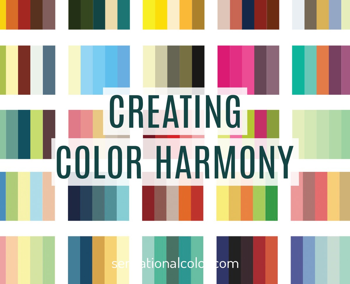
The color wheel is an excellent tool for learning to put together harmonious color schemes. Let this tool guide you to create hundreds of color schemes.
Go to Lesson 2 >>
LESSON 5
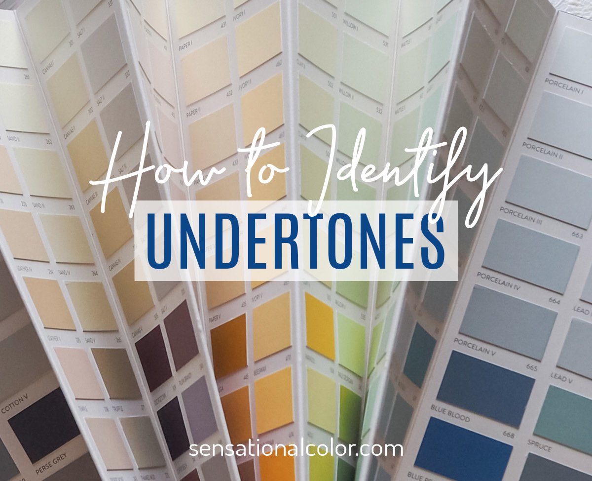
Color is dynamic. Every color has a vibrant public persona, but it also has more subtle attributes that the human eye does not immediately see. One of the most effective techniques for alleviating frustration and mastering color, especially when it comes to neutrals, is to understand materials and paint color undertones.
Go to Lesson 5 >>
LESSON 3
Color temperature describes how "warm" or "cool" a color is. Blue, green, and purple are cool while yellow, orange, and red but there is more to it than that.
Go to Lesson 3 >>
LESSON 6
Go to Lesson 6 >>
More About Color Theory
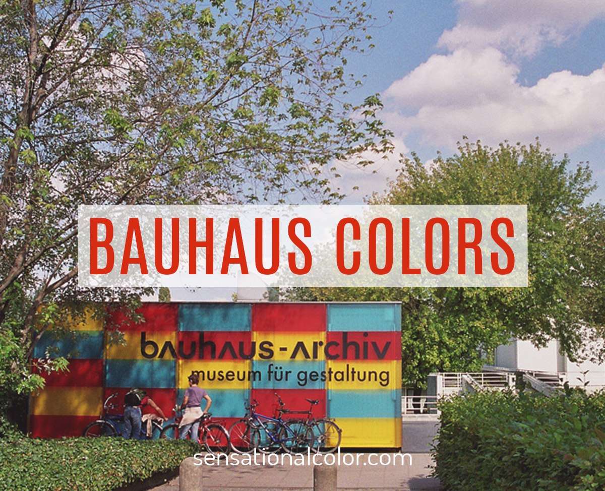
Bauhaus color theory gave us an understanding of how to push beyond representational and to consider the emotional weight of our color choices.
Go to the post >>
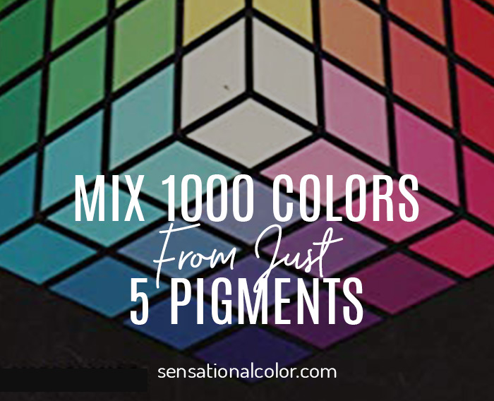
Alfred Hickethier set out to find a way to blend colors more precisely. He came up with the color cube, a model of 1000 individual colors.
Go to this post >>
To understand how different types of light affect color you have to know a little about what light is, how it works, and its relationship to color.
Go to this post >>
My COLOR A-Z won’t give you a full range of knowledge but it does give you 26 color ideas from fun and fundamentals to think about. Enjoy!
Go to this post >>

My Story: From "No Color Theory!" to "Know Color Theory!"
While I have always loved color, I have not always loved color theory, nor did I see a need for it. As a kid, everyone loved the colors I put together. The compliments continued to pour in through my teen years. By the time I set off for university to study design, I had no interest in color theory.
I remember the first day of my very first design class. I was ready to create something amazing and couldn't wait to get started. Then the instructor arrived, and within the first few minutes, I discover that the Color and Design course was just another name for Color Theory class. My heart sank.
The curriculum required me to study color theory two times each week for 15 weeks plus spend countless hours outside of class, completing the assignments, and this was only the first of four courses. It was not what I had in mind at all.
I missed the first part of the lecture because all I could hear in my head was my voice repeatedly whining, "No color theory!"
Finally, with no other option, I shut off the internal dialogue and reluctantly turned my attention to the instructor. I want to say I was immediately captivated, but I wasn't. It took several more classes, but once we started working on the interaction of colors, I gradually got interested in learning more about color theory.
Color Theory Reconsidered
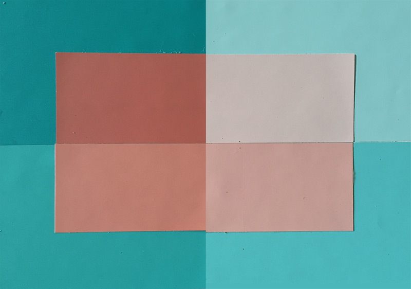
For many weeks, my classmates and I worked our way through the exercises in the Josef Albers Interaction of Color book. The assignments weren't easy, and most took quite a bit of time to complete. There were many nights when all I could see were dots in front of my eyes from staring at tiny pieces of Color-aid paper for hours on end. But with each activity, I learn more and more about combining colors.
Kate Smith
I discovered that every color is like a chameleon that changes based on its surroundings. It can trick us because the same color can look different depending on what colors are around it. By the end of my first semester, I understood what Josef Albers meant when he said, "Color class prepares us to be fooled." I had already been deceived by color many times that semester.
Albers goal in developing his teaching method outlined in the Interactions of Color was "to open eyes" to seeing color, and with me, he achieved that goal. He also opened my mind to the benefits of learning color theory. By the time I begin my second semester, I had gone from whining, "No color theory," to enthusiastically saying, "Know color theory!"
I am still fascinated by the magical ability color has to deceive and delight us with each new design. And, with years of professional experience behind me, today I am even more emphatic when I say, "Know color theory!"
I say that, however, with one caveat. When it comes to using colors, you don't need to know anything about color theory to produce good results. In the end, what matters is that you or whoever you are doing the work for is pleased. Understanding color theory is just one more tool you can use to expand the way you look at and think about color.
Now I want to help you form a base of color knowledge and know-how, too. Let's begin with just what I think you need to know about color theory to noticeably up your color game starting today. Then once you understand the basic principles, there is no end to the ways you can observe and experiment with the concepts.

Talk to Us About Color Theory
Did you learn something new? Is there something else you'd like to know about color theory, creating color harmony or any other aspect of color? Tell us in the comments below.




Amazing post and outstanding work.This is my first visit on your website.I’m enjoy to read your article.The information on your content is very good and well to know.I really appreciate your effort.Thanks for sharing
Color theory!
Very well Explained Kate, This help me to understand something new and unique.
Your tutorial was excellent! So much about color I did not know , but your explanations are great. Thank you
Thank you for this absolutely wonderful resource!!! Loved every bit of it. I would like to know if you have a pdf version of this? Since i would like to come back to this again and again for reference.
Thank you for all ,very helpful and amazing for me
But i want it as pdf or video from where or slids 🥰
Me, too! I’ll be working on that over the summer. 🙂
Yes it’s good
When was this published? I am trying to cite it.
I originally published the basics in 2007 but I have continued to update even this year. 🙂
This website is amazing – Thank you so much!
Aw, thank you, Renate!
I thank you for your detail lecturing me.Today’s lesson was great and good guidance .I loved it
Thank you, Busery. I’m happy that you found guidance in my words and illustrations. Best, Kate
Your tutorial was excellent! So much about color I did not know, but your explanations are great!
thanks!
Thanks for your glowing comment. I will be expanding the color theory information so please do stop back again. There is so much to share. 🙂 Kate
Your tutorial was excellent! So much about color I did not know , but your explanations are great. Thank you
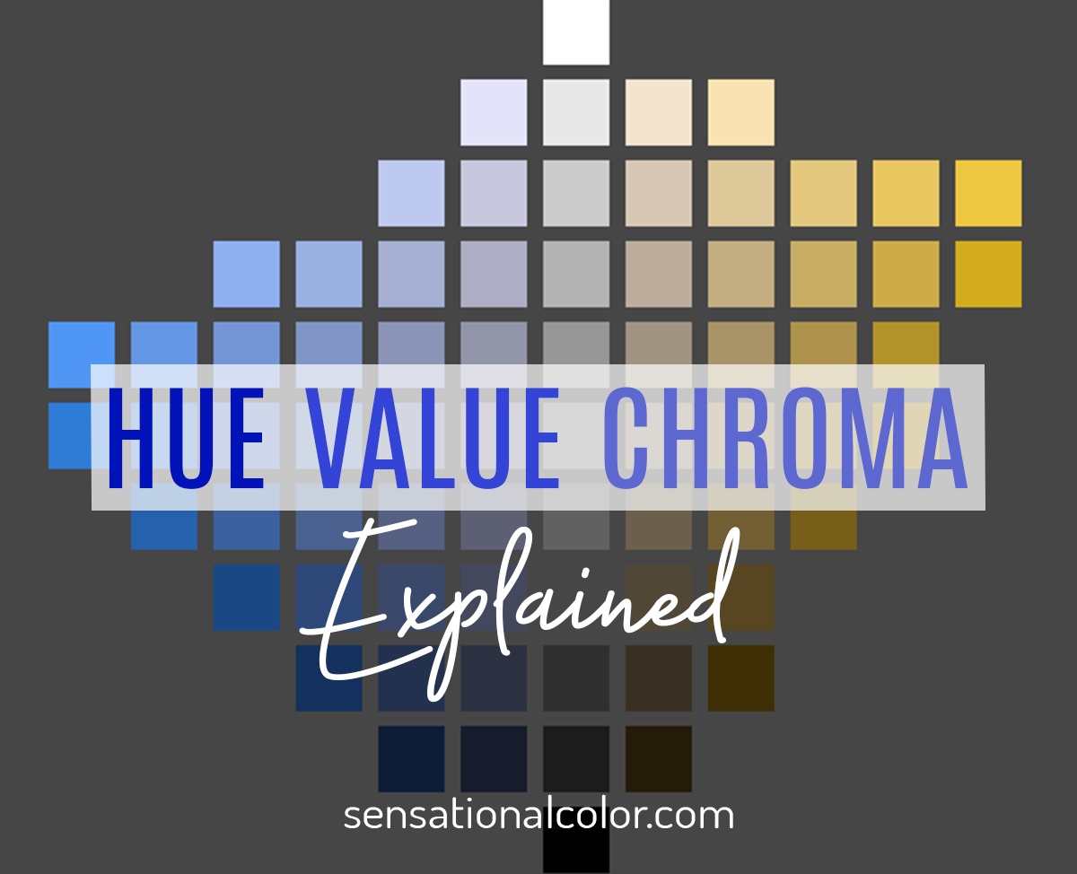
Very helpful! I’ve studied colour theory many times over the years and still don’t quite get the difference between value and chroma.
Also, under Hue on your chart of reds, I can see how the top and bottom rows come about, but the middle row confuses me – is removing red (or reducing chroma?) makes the red less saturated. Correct? Is this lower chroma or lower value?
Thanks so much for your article, Kate, as I am for the first time actually able to formulate these questions. 🙂
Great to hear that this helped you to understand the concept, Deborah. It is difficult to pull the three characteristics but once you are able to do that and see the difference it is amazing how much more sense everything else about color becomes.
Beginning at the upper right red square and working both down and across you reduce the chroma in each square. This is true because any time you mix any other color with a pure hue you reduce the chroma.
As you noticed the value also changes.
Starting at the top and working down the value of the squares in each column are darker than the one directly above.
Starting at the right and working left the value of the squares in each row are lighter than the one directly to its right.
The chart just shows varying degrees of change in chroma and value as you get further from the original hue.
Color is everything to me. As a graphic design and fine artist and on an individual, I experience color in profound ways.
Me, too, Duncan. 🙂
Color helps us see the world around us, defining shapes & depth with shadows. Color evokes emotions differently for each of us, as I love bold and bright colors in my home while most people are more comfortable with fairly muted colors or just a splash of accent color.
You are so right, Tina. Colors are tied to our emotions and bold, bright colors just feel good.